Graphic Design and Illustration.

Archive for ‘March, 2012’

Image of the Month – March

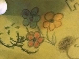
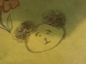
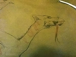
This one was almost going to be a cheat. The weather here in Winnipeg has been rather bizarre as of late. While it has cooled down a bit to more seasonally cooler temps, we’ve had quite a few VERY warm days. We should still have quite a bit of snow on the ground, but we haven’t had any snow on the ground for a few weeks now. Anyways, on one of the warmer days, I was out for dinner with my wife at Montana’s Bar and Grill. What’s interesting is the butcher’s paper they use for table cloths and the crayons they leave for you on each table. I always wind up drawing a dinosaur or dragon or some such while waiting for my meal. I also usually wind up with a server having a bad day whenever I go there. So the sketch I made of a dragon almost became my image of the month. Instead, it became the genesis for this month’s image.

Posted below is a really crappy pic of the dragon I drew at Montana’s and the other two pics are of drawings made by my lovely wife. Not only beautiful, but talented as well!

Dino Update

I wasn’t happy with the way the dino sticker turned out afterall, so I updated him a bit. I think I was trying too hard putting in texture into the dino. I won’t even try to resubmit the new design. I just wanted to improve the image for my own sake. I finally decided on a slightly modified halftone screen to harken back to my good old days of reading comics in my youth. Now that’s a dino to be proud of!

Oh, and in case anyone was iterested. The dino started out life as a marker drawing, was scanned, and tone was added in Photoshop.

Sticker Craziness!

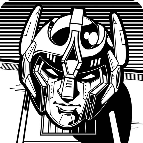
Just to see what would happen, I entered these stickers into a contest. I think the contest might be a bit more “street” oriented than what I would normally go for (I’m considered rather whitebread in Mr Rodger’s Neighbourhood, so judge yourself accordingly) but I was curious as to what I could do with the subject matter. It was basically a black and white, 3″ x 3″ ticket. And hopefully a tie-in with the artist who was co-sponsoring the event. Seems pretty simple. I guess I will find out after the 1st of April, when the contest closes.

The dinosaur was a bit of a stretch for me (unusual since dinos were my first love) but the robot turned out pretty sweet. I may have to use the design in another piece sometime. As for the panic dude, I had drawn something similar to him once before. I think this new version I did turned out better than previous attempts. Probably because it is truer to myself in terms of drawing style than the art style I was attempting to emulate.

1 Comment

The Unexpected Handshake

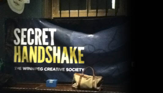
I wasn’t originally going to go to this month’s Secret Handshake, a very loose organization of some of Winnipeg’s creative community, but I managed to get a few things done early so I managed to find the time to run (or in this case walk) over to the King’s Head Pub and see what all the fuss was about. This time around they were going to be celebrating the 2nd anniversary of the formation of the Meetup. And there was supposed to be a super-secret announcement to be made as well. I was intrigued. And that doesn’t happen often.

As per usual, I managed to met a large assortment of people from various different backgrounds. I understand there was another Pollard person lurking around somewhere, but I never did find out who. The place I work at, IS pretty big, and like many organizations, it has quite a bit of departmentalism going on, so there are quite a few people who work there I’ve never met, even after 8 years (!) of being there. Maybe next time.

Since I was curious about the big announcement, I decided since I usually blog about these events shortly after they happen, I thought I’d put on my ill-fitting blogger/journalist hat and investigate just what might be in store for us at the Meetup.

Turns out it was… nothing.

Once I managed to track down out fearless leader and organizer Leanne, (who rather amusingly did not remember who I was until I mentioned where and what I do for a living… seems my work is more memorable than me… I’ll have to work on that) she confessed that there was some technical difficulties in whatever they had up their collective sleeves (I understand it had something to do with New Media Manitoba). A bit of a let down, but that did not mean there wasn’t a few interesting announcements all the same. As my little pic shows:
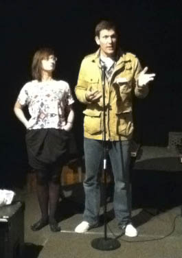
Please forgive the crappy photo. My wife is the photographer in the family. And the photo was more of a spur of the moment kind of thing.

The big goofy-looking guy waving his hands wildly, is Kevin, the Big Cheese at New Media Manitoba. And while the pic isn’t clear, the young lady beside him is the previously mentioned Leanne. And what they are announcing is the New Media Showcase 2012. Here’s a quick blurb describing the event:

It’s going to be a party! Join us as we showcase 7 amazing
New Media freelancers and companies
 on Wednesday,
March 28, 7 PM, 
at IMAX Portage Place!

And it turns out one of the seven freelancers was our very own Leanne! Way to go! Even if you can’t remember me to save your life! That’s pretty cool. Too bad about the timing of the event as there is just no way I could attend. And sorry Kevin, I have it on pretty good authority that angels will NOT loose their wings if people don’t show up to your shindig.

And shortly afterwards, it was pumpkin time for me. It was a school night, and I hadn’t been home all day. And I was exhausted.

Webcomic – Curse of the Tiki Toki, Page 1

So here’s my first installment on the Clint McQueen series, Curse of the Tiki Toki. It’s going to be a very simply drawn comic with a few Photoshop embellishments. I want it to remain fairly visceral and dynamic. And quick to draw 🙂

I’m going with a square format for each scene. It’s a little odd in dimensions, but an art supply store here in Winnipeg recently went out of business and was practically giving away its left over stock in merchandise. They had these very small, square-ish sketch books. I bought an armload of them with this webcomic thing in mind. The books are very portable, so I can take them around anywhere, and being rather small, it will force me to draw quickly, simply and focus on only what is important to get the meaning across for each and every scene I plot out. Should be fun.

I am also going to try and be a little disciplined in when I put these out. Since this is the third Sunday in the month, I’m going to try for that. Except for the next installment. I’ll be away for the next installment, and while I will be bringing the sketchbooks along and plotting out the scenes, I have no intention of brining along a computer to complete the scenes or post them to the internet. I’m certain the throngs of readers  (yeah, right) I have acquired will understand 🙂

So stay tuned for next month, when we see just how Clint will get out of the predicament I put him in, and maybe why I put him there in the first place.

John Carter of Mars. My $0.02

Even though I’m not much of a movie guy, and I’d heard some bad things about this John Carter movie, we went out to see it opening weekend. Actually, we wanted to celebrate some good news in my wife’s photography world, and it was the only movie out that seemed worthwhile watching.

I do not think this movie will do well at the Box Office. Opening weekend and the theatre wasn’t very full.

I was pleasantly surprised though.

I’m not that familiar with the source material. Many years ago, when I was a kid, my public library only had one of the many Mars books Edgar Rice Burroughs wrote. It was well into the series, and while I have read many, many SF and fantasy series out of order, I was totally lost. So all I really know about the series was what was related in Carl Sagan’s book, Cosmos (my childhood bible until I discovered Hichhicker‘s Guide to the Galaxy – but that’s another post) and some cool covers that where made during the seventies/eighties. I DO have most of the books squirreled away on my iPod, but I’ve never had the chance to read them as I’m still old fashioned and prefer books.

But on to my impressions of the movie.

It was pretty good. The acting and dialog could have been a little better, but considering the pulply/slocky source material, I’d say it was mostly appropriate. The visual effects were great. I could have done without the 3D though. It really did nothing to advance the movie so all it really gave me was some sore eyes and a wallet a little lighter than I would have liked. Kimmy wanted to see the female lead wearing more clothes, but I pointed out that most of the popular renditions of the story usually have much less in the way of clothing, so we should be grateful it was Disney who filmed the movie. There was also quite a bit going on (and made the movie rather long). Seems the writers wanted to try and explain as much as they could about the world the Mars books take place in. So my major complaint about the movie is this: it could have been broken up into maybe two movies, braking up the need for all the exposition. My other minor complaint regarding the movies, stems from the soundtrack. This movie is being billed as epic as Star Wars. Say what you will about Star Wars, but it has real awesome, epic music. John Carter of Mars has very forgettable music.

Oh, and Kimmy had some questions regarding the whole 9th ray business. I’d have to see it again, but the room with all the planets showing (and illustrating the power of this so-called 9th ray) may cause some furor amongst astronomers if it does indeed show 9 planets. And we cannot blame it on the source material as I do not think Pluto was discovered when most of the books were originally written (though it was suspected to have been in existence). I doubt I’ll see it again in the theatre (it wasn’t THAT good), but I suspect my in-laws will probably buy it, so I can watch it any time I want, and maybe clear up that mystery, should I still care once it comes out on video.

I wonder if anyone has ever published some sort of omnibus collection of the Mars chronicles, and if I can get a used copy on Amazon. I wonder…

3D Prints arrived!

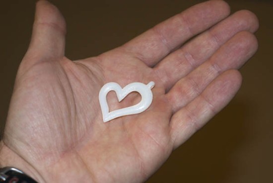
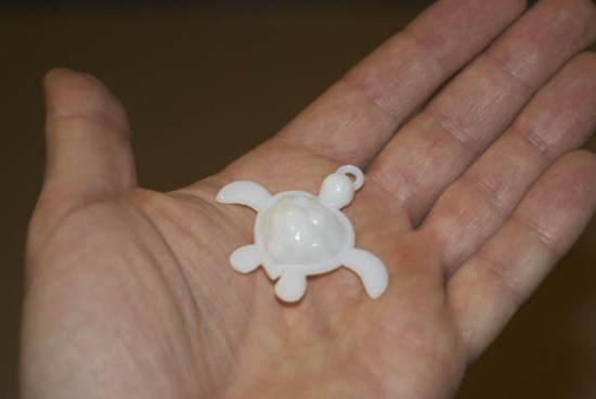
A follow up from a previous post where I posted some 3D jewellery designs I had come up with.

I had them printed out. I had to go with Shapeways rather than Ponoko  as Ponoko has some size restrictions on how small you can go, and these designs are rather small in their total volume. So I will have to wait and see how it is like dealing with Ponoko. They seem to be more a laser cutting and CNC routing sort of place anyways.

Anyways, the turtle and heart pendants turned out pretty cool. The ring on the other hand will jave to go back to the drawing board with. It fits (half the battle). but I think the detail I have might be a bit too subtle. It MIGHT come out better in the silver material (the material I eventually hope to eventually print it out from) but I think if the effect is too subtle in the plastic, I probably won’t be too happy with it in silver. And I’d rather get it right paying five to ten dollars a shot than sixty dollars a shot!

That’s all for the good news. Now for the bad. I designed the honu turtle pendant with some people in mind, but Shapeways is experiencing silver overload in their pipeline, and if I order right this very minute (rather than type out this blog post) and cross my fingers, it might arrive in the very nick of time. As in the day I’m off for vacation. That’s a little too close for comfort, so I’m just going to sit on all this 3D printing until after my holidays. If the people who I had in mind for the turtles ever read this post (and they shall remain nameless in the event some miracle happens) all I can say is, ”There‘s always this summer.”

February Image of the Month

Better late than never! Only a day late mind you. Work has been pretty hectic and I’ve got a couple of little side projects that also required some attention this past month as well.

This image is similar in nature to one of my first Image of the Months. I basically took an image from a rejected work project and finished it off for my own amusement.

The image started out as a pencil sketch and was then recolored in Photoshop along with the ink job. Considering I had less time to colour this pencil sketch than my last several attempts, it turned out rather well. And, as well with my very last post, I was playing around with some of the brushes found on this site. Very interesting use of Photoshop brushes. His drawing blog is pretty cool too.

%d bloggers like this: