Part II – It’s All in the Dots
This is part of a multi-post story on flexography for the designer. You can read more of my previous posts on the subject here.
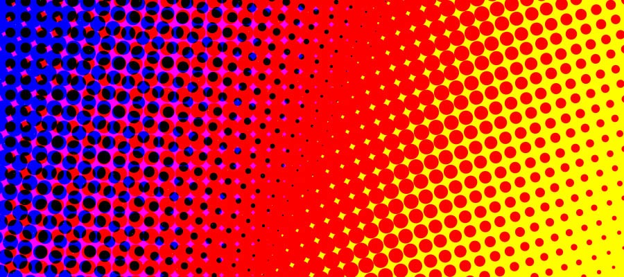
As all print designers know, full colour, continuous tone images are printed using half-tone dots. The same holds for flexo printing as well.
The line screens for flexo printing tend to be a bit coarser than conventional offset printing. Most traditional print is either 133 or 150 line screen. I think 175 is the highest offset line screen I’ve ever designed for. Most of the flexo printing I am familiar with ranges from 120 – 133 line screens. But I have seen designs printed as low as 65 line screen.
With lower line screens, there will be less detail in the images produced. Often, this means that designers and illustrators wind up creating highly detailed images where most of the detail is either lost completely, or becomes just a small mush of dots.
So simpler is better. Try to keep your imagery fairly simple and graphic. It will help not only with continuous tone work, but will help with line art and other vector style artwork as well.
You will also find that halftone dots printed flexographically will tend to not reproduce as well as you might be used to. Screens of 70 percent or higher tend to plug up and light screens tend to get quite a bit darker. And over all, the dots won’t look as clean and uniform in appearance as you might be used to. Nice even graduated tones of colour can be difficult for flexo presses to create.
Minimum Dot
Perhaps the biggest problem facing flexo printing is something called minimum dot. Made from a thick, flexible polymer material, very small halftone dots on flexographic plates cannot be safely reproduced. These dots may flop over and cause the printing ink to splatter all over the place. This usually means there is a cut off point – a minimum dot. Usually, this is around 3 percent. Where I work, we have very sophisticated digitally made plates and can go down to 1 percent. I have heard of minimum dots as high as 5 percent.
This means that no colour can fade off to zero. If an object in your design have gradients of colour in them, they must contain at least the minimum allowable amount of all the colours you are using for that gradient. For example, a gradient of red to yellow must have percentages of magenta and yellow in all the steps of the gradient.
At first, this doesn’t seem like too much of a problem, but once these 1, 3 and 5 percent dots print, they often gain on press to be as high as a 10 or even 20 percent dot. That means the nice juicy orange fruit in your design that has some cyan in the shadows will look pretty green and rotten when printed. So you will want to make certain that the process colours you choose for things are as clean and non polluted by unneeded colours as possible. Reds shouldn’t have cyan in them, blues should be free of yellows, greens shouldn’t have any magenta, etc. This can make reproducing photographs quite difficult, and may require extensive Photoshop manipulation to get the colours looking just right. I could write post after post on different techniques that could be employed to correct these kinds of problems in Photoshop, but it would probably make most designer’s head explode with all the technical details. And honestly, if you have good technicians with enough time to deal with your imagery, designers shouldn’t have to spend too much time cleaning up the images. Especially if the image was well chosen to begin with.
![[A] Shows a sample gradient going from yellow to red. The dark red has a bit of cyan. [B] show what happens when minimum dots of yellow, magenta, AND CYAN are added to the gradient. [C] shows a nice clean gradient with only yellow and magenta. This is preferred.](https://eyeopeningdesign.com/wp-content/uploads/2014/04/gradients.jpg?w=860)
[A] Shows a sample gradient going from yellow to red. The dark red has a bit of cyan. [B] show what happens when minimum dots of yellow, magenta, AND CYAN are added to the gradient. [C] shows a nice clean gradient with only yellow and magenta. This is preferred.
When choosing a photograph to reproduce, make certain the colours are as pure and bright as possible, without a lot of really light colours (more on this in my next post when I talk specifically about colour choice). And try to get as much contrast as possible. Colour tends to flatten out when printing flexo, so the more contrast you start out with, the better. Making certain your shapes are clear and distinct will help a lot. A nice faded, blurry background may cause a lot of problems and introduce a lot of minimum dot issues that may be hard to resolve.
Shadows and Glows
Since halftone dots cannot simply drop off to zero, things like soft drop shadows and glows can become a problem. And designers just LOVE drop shadows! Or at least their clients do. Drop shadows in particular are a problem as the black used in a soft drop shadow will have to carry out in the entire background of your design! The minimum dot issue I have already talked about will prevent your drop shadow from fading off to zero percent. This will make the background a bit darker and dirtier looking. The only other solution would be to abruptly end the shadow transition, but with the dot gain flexo presses are known for, this can create a very noticeable, and ugly looking edge.
It is best to either avoid drop shadows altogether, or use a hard-edged shadow. I know, I know, 1995 called and they want their design back, but what can you do? You can use soft drop shadows if black is already being used throughout the background of your design. Then carrying the minimum dot throughout your design will not be as much of a problem.

A nice hard edged drop shadow. It may be a bit old-fashioned, but it generally works the best in flexo printing.

This drop shadow has a nice soft edge. A minimum dot had to be carried throughout, making the white background look much duller.

This background already had lots of extra black in it. A soft shadow is easier to maintain in this instance.
Glows have much the same problem as shadows. Glows cannot fade off to zero percent, so everything gets a bit darker. This can produce some unwanted results. And resolving minimum dot issues with glows can be much harder to solve than drop shadows. Especially with a complex background. Glows are often something to avoid altogether.
In my next post, I’ll begin to talk about colour and how your colour choices will drive everyone in production crazy!