Graphic Design and Illustration.

Archive for ‘October, 2019’

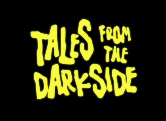
Tales from the Darkside – Final Week


Done at last! This last entry will be a short one.

The Interview That Wasn’t

This took place right around my second Graphic Design gig. I hadn’t been there very long and there really wasn’t very much work to do. It eventually changed, but the first year was very, very slow. Made me nervous. So even though I had just gotten a new job, I kept up the job search just in case I was either laid off, or the place closed down (it was really slow).

One place I applied to, decided they needed someone really, really quick. They tried phoning me up at home (I was still living with my folks; earning enough to move out was one reason why I changed jobs) but I wasn’t there. They wanted me to come in and interview within the hour, but my Dad told them I was at work and that just wasn’t possible. They could phone me up later and book an appointment like regular people. This was before smartphones (and the general ubiquity of cellphones) and having an email that could reach you just about anywhere was still a few years away. But that’s okay, they had a solution.

The phoned me up at work.

Now, I didn’t really have my own phone at work. We did have a communal phone for the whole department. And a pretty open concept office design, making it pretty hard to have a private call. Not to mention we had someone working in the main office who really didn’t like employees getting personal calls while at work. So depending on who answers the phone, this could get real interesting.

But as luck would have it, the call didn’t get transferred to the communal line. It went straight to my supervisor’s phone instead. I never said it was good luck. Now, my then supervisor could be the prickly sort. At the time, that wasn’t an issue for me. We got along fine at the start. But I would imagine even a fairly easy-going boss wouldn’t be too enthused about an employee fielding job interviews in the workplace.

So there I was with the receiver in hand, and my career flashing before my eyes. Turns out my heart can stop beating for a long, long time before starting back up again. Anyways, the person on the other end understood the situation they had placed me in, and that I couldn’t really talk, but could I get over there in 45 minutes for a job interview? Needless to say, the interview never happened. We weren’t busy like I said, but busy enough that day that I couldn’t just bolt like that. Especially since I was punching a time clock, and wouldn’t get paid if I was out and about.

And the worst part? Not my worst job interview. But that will have to wait until next year’s Tales from the Darkside!

Fat Pixel Font Design


Quite some time ago, I had to quickly come up with a few letters for a custom font (or at least trying to match a type design for a font we didn’t have and wouldn’t spend money on) and so I decided to try and create en entire alphabet around it. Came together pretty quickly. Old fashioned 8-bit style fonts are pretty easy to put together, though there are almost always a few glyphs that take some trial and error to get working right. I think this on took about 45 mins or so (like I said, quick!) to put together. That doesn’t include putting together font metrics. Enjoy!


Tales From The Darkside 2019 – Week Four


Pass or Fail

Way back in the dawn of time, when I was just starting out as a design student, we had a really, really fun class where we did a lot of line ruling the old fashioned way. The really old fashioned way. With a ruling pen, much like the one below.


I HATE ruling pens. Really. They might be good for making really cool calligraphy strokes, but they are a total paint in the ass for drawing a bunch of interconnected lines in uniform height and width. My first art director couldn’t figure out why were weren’t just using tech pens for everything.

Anyways, in the class we were in, I believe a pass was 70%. That’s right. Seventy percent. And the first assignment we had, the prof went over everybody’s little drawings together in class. Quite the humbling experience for everyone. I only got a 60%. So no pass. Or so I thought. When the prof was going over everything with us, he was kind enough to give us tips as to what we could have done to improve our work. He then went over to the students who were close to a pass to explain that for this first assignment we could make the suggestions he made in class and turn it back in to get remarked to improve our grade. This seemed like a no-brainer to me.

Say it with me now, “It’s a trap!”

The next week, we got our assignments back. Only this time with a 40% on it. Now it was a fail no matter how you sliced it. I wasn’t the only one. A bunch of us approach the teacher and asked what gives. His reply? After the advise he gave he marked it harder than before.

I was usually pretty good at school. I liked most of my teachers. Generally got a long with everyone. Mostly. This was the first time I think I ever saw a teacher as a potential adversary. It was quite jarring. I’m pretty sure it was meant as a warning to any and all to not get too pushy about trying to argue about our marks. It worked.

Tales From the Dark Side 2019 – Week Three


This one is a little late, so you will get two of them this week! My only excuse for missing my own deadline is I hate Linux distros. I could use it as fodder for an upcoming Tales from the Darkside except it wasn’t work (graphic design) related. So on with the show!

Tale of the Misspelled Name

Quite a few years ago, a company I worked for would periodically layout out pages for a local children’s book publisher. The one I am thinking of was a very special case. A local designer (who became one of some note over the years) was going to both do the illustrations and design the book. Since we had a template of their catalog page and the location of the ISBN number for the back cover, we would be looking after that part of the book and nothing else. It was also a bit of a departure from the rest of their books. They usually printed in full colour and usually seemed to be targeting younger readers. This one was black and white only (except for the cover which was 2 colours) and seemed to be geared for slightly older readers (lots more text and fewer illustrations – though not a chapter book). The only thing of note for this job should have been the Jazz drive (that’s really dating myself – look it up) we had to purchase one to do our part of it. Since the illustrations were only black and white line drawings, they were scanned in at very high resolution (1200 dpi) so a SyQuest Disk (yuck) or Zip disk wouldn’t easily hold all the uncompressed illustrations. The 1 GB Jazz Disk was all that was really easily accessible at the time. It was a few years away before re-writable CDs, then DVDs, became widely available, thus killing off all the rest of the high density portable disks.

This should have been all there was to it. Except for one little thing. Luckily it had nothing to do with me, even though I was the one tasked with “fixing it.”

The author’s last name was misspelled on the outside back cover.

This wasn’t discovered until the print run was completed. The author was apparently really cheesed off. I don’t think the publisher was much impressed either. This set off a LOT of changes. And I mean a lot.

The designer who originally designed the book hadn’t been a designer for very long (neither was I at the time) and was fairly young (ditto for me, I was about 20 or 21 at the time – I think the designer was only a few years older) and made some poor choices design-wise. Mainly the body copy. It was a display typeface (Lambada Plain) that was used to great effect on the cover, but was too small and too novel for a font for all that copy, especially for younger readers. So all that had to change. But the best part, the author took it upon themselves to layout the whole book in Microsoft Word (or maybe even WordPerfect) and I was to match it EXACTLY. QuarkXpress (the only real option at the time – my how things have changed) had some pretty different ideas on how to handle type than basically any word processor. Adding a still fairly green designer (me) to the mix and it was pretty rough going trying to match everything up.

But that wasn’t everything. There was one more really big problem. One we didn’t really fix. The illustrations. The book’s plot was kind of complicated. Without giving too much away (the book is out of print, but can still be found online through places like Amazon – I’d like to prevent people from being embarrassed by this post) there was a little boy who had a series of dreams. Things happened to the boy in the dreams that changed his appearance, but only in the dreams. The illustrator got a little confused and slipped up on one of the drawings. I was asked if it was possible to take a piece of one of the other drawings and transplant it to the problem illustration. Due to the large file sizes and the computing power available in the mid 90s (I was on either a Quadra or an early PowerMac at the time) it would be a slog, but it was possible. It was decided that since the copyright still belonged to the illustrator we wouldn’t change anything unless we had permission from the illustrator. Considering all that happened it’s not surprising we didn’t do that. I suspect there was a lot of ugliness I never saw.

Though we did change the cover a bit too. Remember, that is was only a two colour job for the cover? Well, the colour the designer/illustrator chose was pretty dark. The publisher then chose something quite different. In my opinion, it went totally the other way and was too bright. Do stare directly at this cover or you’ll go blind. But considering the very frosty look the publisher gave my Art Director over the term “PMS Colour” (they only ever printed in process colour before, so I imagine she never heard the term before) it was probably best not to argue with them. Fun times all around.

Icons


Grids, grids and more grids. Designers are always going on about grids. Well, most of the time. I trained in being a designer early to mid nineties when grunge was in full swing. We were rebelling against grids. At the very least we were all using very untraditional grid structures. So grids sometimes still seem a little alien to me. So this summer I decided to try and fix that.

I picked up a grid notebook from Walmart of all places (the price was right and it had a grid and was pretty huge) and I went to town. Just playing around with some icons, pictograms and lettering. Even some 8-bit art. Anything that really lent itself to a very strict grid structure.


You will have to excuse the very random strokes in the notebook. It’s pretty hard to convince little ones not to play in Dad’s stuff. They have sketchbooks, crayons, pencils and markers. And it makes no sense that all of Dad’s notebooks, pencils and makers are off limits. And it’s hard to get mad at them when you are trying to encourage their own creativity. Not to mention Dad always leaving his stuff around within reach. Luckily, the damage done is minor and easily filtered out or ignored for final production.

The final piece at the top shows some cleaned up final images. Some things there will be pretty recognizable. I think I’m the only person of my generation that never had a Gameboy, though I did spend a summer hanging out with a cousin of mine who had one. He let me play Kirby and Castlevania on it. I thought the Playdate hand-held announced this year was pretty cool as well. EOD is short for Eye Opening Design (this blog), and 44 is my current age. Enjoy!


Tales From The Darkside Week Two


The Tale of the Logo Meltdown

Once upon a time there was a small chain of locally owned restaurants. They basically ripped off a logo from a large restaurant chain in the US, and they got some rather angry letters from their lawyers to change their logo ASAP.

The problem was of course, this unnamed restaurant didn’t want to change their logo. It was distinct, and they had it for years. And it was good. It was just a teensy-weensy bit unethical. And it was felt was in violation of someone else’s IP. There was a lot of back and forth between these two groups of lawyers as they were fighting over pretty meaningless changes while ignoring the fact that the logo had to be pretty much redesigned from scratch. It makes sense where you think about it. Lawyers are all about the details, the fine print. Arguing over letter spacing the the size of characters doesn’t really make sense when you can take printouts of the two logos and have them line up perfectly. Other than a couple of different letters that made up the difference in their names, they were identical. Yes, even the names were very similar. I found out much later even the decor of the two chains were pretty close. Eventually the logo was pretty much redesigned from the ground up.

The company I worked for at the time managed to yank the account away from another agency (or in this case a printer) mid stream. So some prior work had already been done. After a lot of back and forth (and I mean A LOT) we finally settled on something. It was, of course, the weakest option we gave them. We fell prey to what is commonly called the “law of logos” or “the client will choose the worst one.” This goes for just about everything in design. When given the choice, your client will always choose the weakest option. I think it just boils down to designers having bolder tastes than most of their clientele. It is just an occupational hazard that your clients will often leave you feeling a little disappointed in them. You just have to cherish the times when that isn’t true. Where your clients push you creatively instead of the other way around. And never show your client something you aren’t prepared to do. That will save you a lot of personal pain down the road.

Bu that wasn’t really the worst of it. Remember that printer we yanked the account from? They printed all the initial material with the new logo. And for some reason they managed to screw up everything we gave them. Each piece was mangled in bold and creative new ways. Can’t imagine why.

Western Martian

<hr>

This was a weird idea. Think of Mars as a giant dessert (not hard). Now imagine colonists living on Mars. Ignore the developmental problems of humans living in a much lighter gravity environment. How would we adapt culturally to this alien world? I thought maybe a resurgence of western style garb. With some future tech enhancements. Instead of Steampunk think Westernpunk. Just a nice quick, rough traditional pen and ink sketch, with some very loose digital colour.

I wanted everything to be fairly loose. My day job as a designer demands my work always be very precise and meet the demands of a never ending list of specs. It’s nice to just play around with huff and see what happens.

I think I’ve also taken some liberties with Mars’ two moons. I don’t think they would be that large and visible in the sky. Enjoy!

Antelope Girls


This is a new one.

Over the summer, I took a sketchbook with me on our first family road trip. I tried to sketch a little bit every day. Or maybe every other day. Or every other, other day. Anyways, I did manage to get some stuff on the page. This theme of little girls as antelopes (we were travelling through Saskatchewan and Alberta so it makes sense) came out of that.

This drawing was NOT the result of that sketching. My day job gets pretty technical. Lots of numbers and math. I tend to keep a scrap sheet of paper around to keep track of stuff. It also seems to be the place where I do my best sketching (and daydreaming!) This final image came from one of those sketches.


The original sketch. Like the notes I take for myself?


So All I did was take a quick snapshot with my phone (it was a pretty basic sketch, and I wasn’t out to impress anyone with my preliminary drawing) and dropped it into Photoshop and started painting away. A couple hours later, and all was finished.

I have plans for this one. Enjoy.

Tales from the Dark Side 2019 Week One


So here goes!

WEEK ONE

Quite a few years ago, at the dawn of time, I was enrolled in a local community college taking something called Advertising Art (I believe these days it’s called just Graphic Design). There, the instructors took great pains to make our lives miserable. Even though the computer revolution was well under way, we were still doing quite a bit the old-fashioned way. That meant lots of fun assignments like this one: constructing and painting our own colour wheel. Fun stuff!

To keep things fair, we all had to use the same colours, mediums, and manufacturer of paint. Windsor & Newton Gouache Bengal Rose, Cadmium Yellow and Cobalt Blue. We had to mix all the secondary colours ourselves. Gouache seems to have a bit of a resurgence these days, but back then, it was getting pretty hard to find. Graphic Designers had stopped using the stuff, and water colourists weren’t using that much of it. Not to mention, you have to sacrifice to the right gods to get a nice flat coverage (which we were being graded upon), dark colours dry lighter, and light colours dry darker. Always and adventure to find out what you might be getting! Especially at 3 am after the umpteenth dozen failures.

So you go through the paint like there’s no tomorrow, and it is pretty hard to find. The 2 local art supply stores had stopped carrying the colours (and the brand, and pretty much Gouache entirely). And the instrutors weren’t cooperating with the local vendors on alternatives.

Basically, we were all screwed. Especially me. I was a drawer, not a painter. This was all very new and very scary to me. Someone in the class had found a supplier out East that would help us out, but it was looking more and more like the shipment wouldn’t arrive even close to on time.

Enter, my maternal grandparents. They were wintering on the West Coast. My Grandfather, a retired furniture designer, painted as a hobby. He checked out a place called Opus Art supplies in Vancouver. They had it in stock. Did I want some? YES! How much? ALL OF IT!!!

So I got my little box full of paint tubes. The other shipment from the supplier out East did come through last minute for everyone else. Those tubes lasted me a long, long time.

Every time I’m in Vancouver, I make a pilgrimage to Opus to pick something up. I’ve only been to Van-City twice in 25 years, so it’s not that exciting. But it is a fun story to tell.

%d bloggers like this: