Happy Canada Day Everyone!
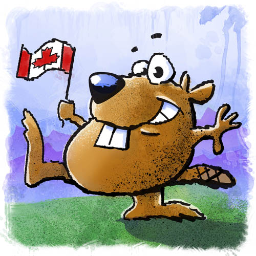
Just a quickie sketch that uses just about every digital trickery I know to make it appear to be a more traditionally painted water colour/pen and ink stuff I used to do in my younger days. Enjoy!

Just a quickie sketch that uses just about every digital trickery I know to make it appear to be a more traditionally painted water colour/pen and ink stuff I used to do in my younger days. Enjoy!

Summer has now officially started up, and it looks like we’re actually going to see some sun for the next few days. So in celebration, I’ve posted this image. Just a note – I do not actually own a car like this (nor does anyone as I based the details of the car on several different models of old cars), nor am I planning a road trip any time soon 😦
Anyways, mostly a Plain Jane vector illustration with a few effects thrown in just ’cause I can. Enjoy.
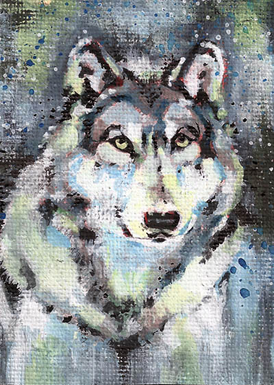
So this month I finally got around to finishing off the WIP I had for the month of April.
I managed to get the wolf printed out on some very heavy linen textured paper, where I proceeded to first paint an underpainting in various shades of red. I chose a red as I knew I was going to finish off the piece in mostly cool grey tones. Choosing a warm tone for the underpainting of a primarily cool toned final painting is pretty much Underpainting 101. Once everything was dry, I went to town and finished off the painting.
Keep in mind when viewing this piece, that it is the same size as a business card, so detail can be a problem, AND I chose a style that would be very textured in appearance. All in all, I am pretty happy with the way it turned out.
Now all I need to do is track down a geocaching tag to make this a trackable item. It looks like for this to work, I’m going to have to hole punch this thing. Probably in the bottom left or right corner. Hopefully I know someone who is big into arts and crafts, and has a eyelet punch I can borrow, as I think I might want the extra durability if I want this item to last for any length of time.
After much work (and one or two accidental posts that the world wasn’t really supposed to get) my website and blog are up and running once again!
I changed the theme of my blog today to the Portfolio theme. As a designer, I feel bad that I went and used someone’s theme, but it was setup much the way I was thinking of running a portfolio style blog, so I figured it was worth the extra cash and spring for a pre-built theme than hosting a WordPress blog somewhere on my own. This change also meant I had to drastically alter the way I set up my site. I used pages instead of posts to originally layout my design and illustration portfolio. In order for this theme to work it’s magic, the site needs to be all posts instead. I had to take the site offline to ensure anyone out there following this blog doesn’t suddenly get flooded with a whole whack of posts from me. Especially since it was all old content.
So for anyone out there who had never actually checked out the site in it’s entirety, please feel free to check it out at stevendownie.wordpress.com.
Just a few housekeeping notes to take care of here.
Over the next few days, I’m setting up the site to be a bit more friendly to keeping on online portfolio up to date and running. It will take a couple of days to get the whole thing rolled out, so visitors to the site might find a few things amiss. Not to worry, the blog should function normally and I imagine everything should be back to our regularly scheduled programming by the end of the week.
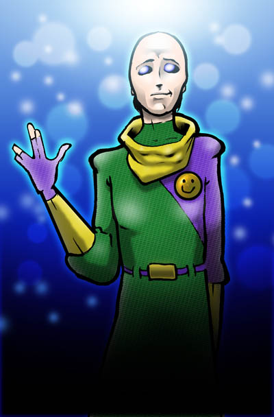
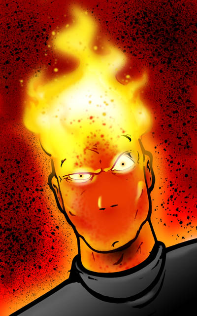
This should be my next to last post in my ongoing theme of digging up old art to publish online. These last ones here are more of the same. Just old line drawings that have been scanned and coloured in Photoshop. Otherwise no real theme to any of these images, just a lot of ideas I was playing around with in the sci-fi/comics genres. Enjoy.
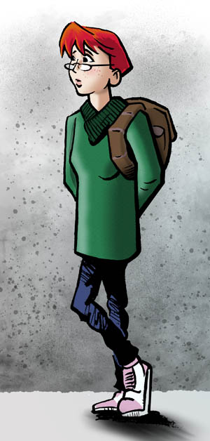
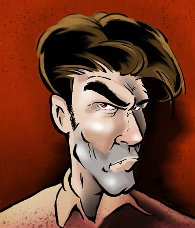

While it has been quite the trend the past few weeks, I am just about done going thru some of my older stuff and getting them digitized and published online. Eventually, I’ll just put up a page that will contain all these images. But for now, on with the show…
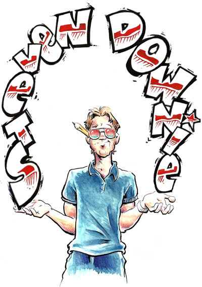
This first one was done quite some time ago. I was still in college (so over 17 years ago, if anyone is keeping score) and I’m pretty certain I was doing this image when I should have been working on a school project. Done in water colours with a bit of pencil crayon for some details. Pen and ink for the lines.
I think I was looking for something illustrative for some possible self-promo work once I finally graduated from school. Never used it for anything though it was in my portfolio for years and years. Believe it or not, the type I lifted (i.e. stole) from a car dealership ad. I rarely if ever hand draw type anymore, but it was still part of the curriculum when I was in school. Definitely not something I miss!
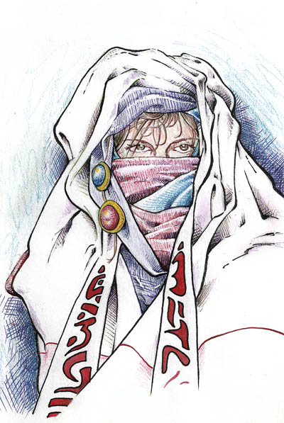
This next image needs less of an explanation. When I was a teenager I fell in love with both the stories written by Michael Moorcock and the book covers that were coming out at that time for his books. Here’s an example:
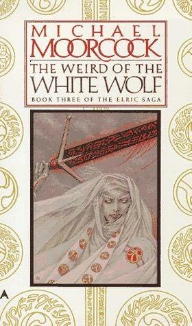
My image was an early attempt at trying to tap into that style of drawing. The “type” used in my piece is just a made up, fantasy alphabet I very quickly made up.
I’m not entirely certain I am done with that motif though. I may wind up doing something else with that image. Perhaps I can convince a certain someone to help me out and pose for some reference material… hmmmmmmmmmm.