Graphic Design and Illustration.

Posts tagged ‘font’

Fat Pixel Font Design


Quite some time ago, I had to quickly come up with a few letters for a custom font (or at least trying to match a type design for a font we didn’t have and wouldn’t spend money on) and so I decided to try and create en entire alphabet around it. Came together pretty quickly. Old fashioned 8-bit style fonts are pretty easy to put together, though there are almost always a few glyphs that take some trial and error to get working right. I think this on took about 45 mins or so (like I said, quick!) to put together. That doesn’t include putting together font metrics. Enjoy!


Q


An experimental type design. I wanted to see if I could come up with something a little different with the letter “Q” while still keeping it very formal. Out of serval iterations not shown, this one was my favourite. Now if I could just get the CBC to look at it…

Enjoy!

Font Experiments

Font design is a complex design issue, barely raised in my old design classes. Getting a minimum of 26 upper and lowercase letters to work together to form words along with punctuation, numbers, accents, and other foreign language characters – you get one daunting task.

Over the years, I have dabbled in font design. While I have never released anything, into the wild, these are a few designs I feel confident talking about on my blog.


Totally 80s Font


Inspired by 80s era neon signs.


Technoindustrial


This was my first attempt at font design. Done way back in 1998, this was a make work project to teach me how to use Fontographer. While it looks crude today, it still can make nice words and short phrases. Perhaps one day I will update the worst offending glyphs. Mostly the “S”, ”E”, and “F”.


Positronic


Inspired by the likes of the Tron and Terminator movie franchises. A very masculine and techno looking typeface.


Bitmap font


An experiment in type design, Bit Map simply started out as Helvetica with an Illustrator effect applied to it. A year or so of painfully tweaking the results left me with this – a totaly different and unique looking display font.


Not This one


Still a bit of a work in progress. A simple sans serif font inspired by the fun magnetic letters of my childhood. In fact, I have hopes of getting a version of this one laser cut in plastic shapes. Named after my son.


Forever


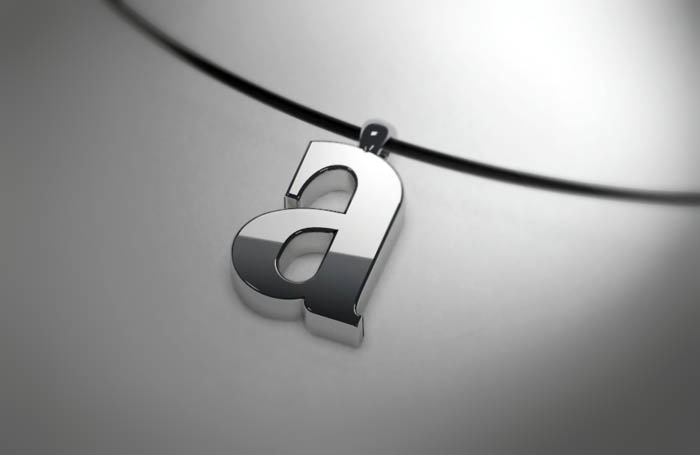
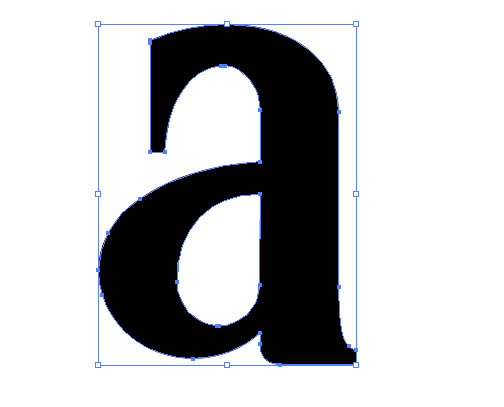
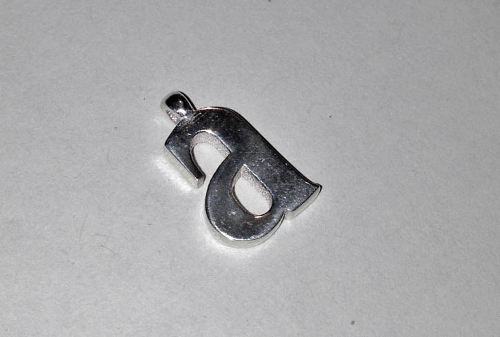
Loosely inspired by a really small and low resolution shot from Calvin Klien’s Eternity men’s cologne I found while Googling for something else (honest). Had to make up a lot of new letters.


Enjoy.

A+

A_render


I made this little gift originally for my son’s baptism. Unfortunately, I couldn’t get it made in time for the service, but it was the thought that counts. It arrived by UPS today. Its made in sterling silver by the awesome people over at Shapeways. Since my son’s name is Adien, and a cousin of his (named Andrew) signed a card for him, “From big A to little a”, I thought a pendant with the letter “a” would be appropriate.

The lowercase “a” is a custom letter designed my me. I was actually going to use a lowercase “a” from the font, Americana Bold Condensed, but the little sketch I made (that I no longer seem to have) to remind me of the font I had chosen looked much better than the actual font, so I used the sketch as a base for my pendant design.


My original sketch.

My original sketch.


Illustrator A1

Adobe Illustrator vector.


Illustrator A2

Showing the editing nodes.


I first drew the outline in Illustrator and then imported the SVG file into Blender. And after a few final touches, I sent the file off to Shapeways to be 3D printed in sterling silver.

Now all I have to do is find a nice chain to go with it (Shapeways cannot 3D print interlocking pieces in metal).


A quick snapshot of the 3D printed piece.

A quick snapshot of the 3D printed piece.


More of the 3D printed experiments can be found here:

A 3D Printed Planter

Sterling Silver Prints

Even more 3D printed stuff