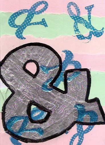
Project Ampersand

In looking for interesting art project to take on, I stumbled upon this website for the Sketchbook Project. It is a library of sketchbooks from people all over the world. Much of it appears to be online and there is a physical library that moves around to different parts of the United States (and very occasionally, Canada) for people to browse through and be inspired.
Unfortunately, based on my understanding of the project, you have to use one of their sketchbooks to participate in the Sketchbook Project. A little while ago, an art supply store in Winnipeg closed its doors and had quite a good liquidation sale. Consequently, I have plenty of sketchbooks on hand, and won’t need a new one for quite some time. So I couldn’t justify buying into the project. But they did have a side project, the Ampersand Project, that was more compelling (and easier for me to justify).
Here is a brief expert from the site that explains the project:
Through hundreds of works of art, The Ampersand Project will explore the ways each of us can interpret something as direct as a written symbol like the humble ampersand (&).
Being that “&” means “and,” we feel like it’s the perfect character to symbolize an exchange that connects you and another person. Make a simple image that interprets this unique piece of our letter-set and we’ll send you the work of another participant in exchange.
I signed up for the project and received the kit in the mail a few weeks later.
The project consisted of a pre-gessoed art board from a company called Ampersand (I think I know how the name of the project came about) and a copy of the rules and where to submit the final art.
All I needed was an idea that fit the theme.
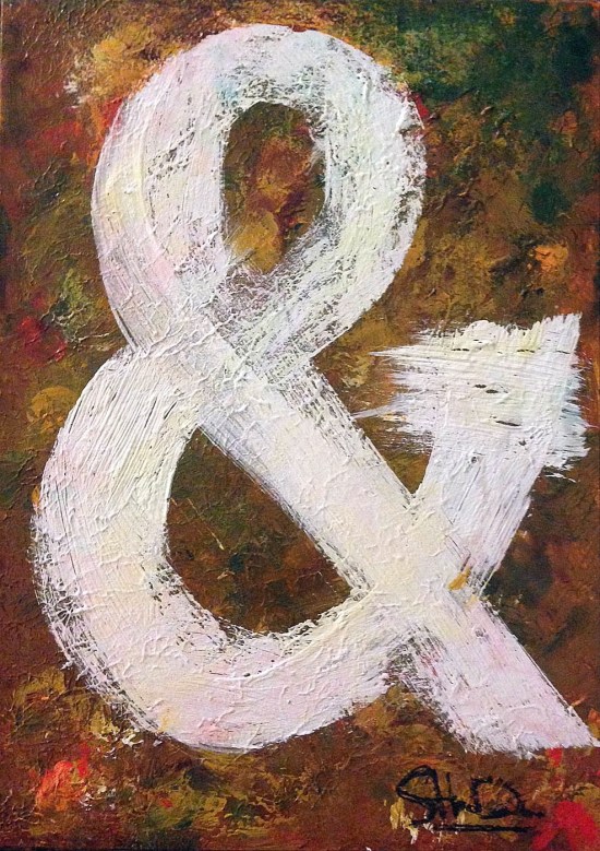
Being a graphic designer, I thought it fitting that I literally paint an ampersand. Though I must confess, that after doing more than my fair share of hand lettering in school, I swore off hand lettering type once I graduated. Having to hand letter New Baskerville Bold in 16 point type for a logo using gauche kind of kills ones enthusiasm to actually hand letter type. Though I do admire the people who hand letter type. The good news was, I am a designer who learned his craft in the mid nineties, so I was not too adverse to some grunge lettering. Exactness need not apply.
But just painting an ampersand still seemed a little boring, so I though of adding a little twist to everything. How about a little collaboration? How about Artist AND son? Seemed like a great idea to me. And with my son Aiden being just 10 months old at the time, I figured he would be pretty easy to convince to participate.
I first started out painting a very basic foundation using a colour scheme I pre-selected. The pre-gessoed board was very, very smooth and I was unsure if it would lend itself to the rough, grungy type I wanted to paint later on. But luck was on my side…
Once I got a base coat of paint I was happy with, I let everything get bone dry. Then I grabbed my kid, some newspaper (actually, quite a bit of newspaper), and some Crayola non-toxic finger paint (I was using proper, grown-up acrylic paint for my part). I then liberally put large globs of finger paint of the board and let my kid do his thing. Since the paint was very globby and tactile, Aiden was all too happy to smear the paint all over. And proving he is his father’s child, managed to get just as much paint on him as the canvas. Nice to see the apple doesn’t fall far from the tree!
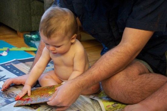
Artist hard at work.

Admiring the handiwork.

One messy, messy baby. Dad wasn’t too clean either.
For anyone interested, the finger paint dried onto the acrylic as an almost translucent gel. The yellow, pretty much disappeared altogether, with the green and red showing up the best. Much of the blue turned green though, as I think I put yellow finger paint on the most and that readily turned green when mixed with the blue. Duh!
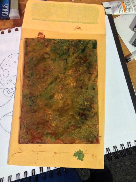
Afterwards, I added some more colours in acrylic. The colours I chose and their placement were influenced by where my co-contributor placed his colours. For those people reading this who have access to the original art, you will still see some of the finger paint showing through.
And as it turned out, the very goopy finger paint created a nice rough surface for me to paint my grungy type on. Perfect! And quite lucky.
I cheated on the type though. I printed out an ampersand on my printer at home and cut it out using an exacto knife. I then used the cutouts as a stencil to aide me in my type painting.
After everything was dry, I sprayed everything with a fixative as I wasn’t too sure what would happen to the finger paint over time.
My piece has since been mailed in for submission. I’ll post an update once I recieve my swapped painting in the mail and will try to provide a link to my digitized painting at the official Ampersand Project web page.
EDIT:
The Ampersand Project is now closed, with all results digitized. There is a Flickr stream of the images available. Mine can be found by clicking here. We have also received our painting swap. From someone named Lesley Wilmoth. Too bad that is all the info I have. It is a nice multi media panting with lots of interesting textures. The colour scheme will fit quite nicely with the decor of my co-artisit’s room and will be hung with pride once I can track down a suitable frame. You can see the image here: