Graphic Design and Illustration.

Adventures in 3D Printing

20140630-204920-74960594.jpg


It’s been awhile since I blogged about my experiences in 3D printing. Several months ago I found out a close friend of my family (and one of my son’s godparents) would be going away to Seminary to become an Anglican priest. Since he had been such a big part of both my wife and son’s life, I thought he should get something personal from us as a going away present. and since he was also the Organist and Choirmaster of our Church, I wanted to get something good.

Our Church has, in my opinion, a rather nice Sacred Heart Statue in the Sanctuary, and I thought it would be a nice gift to have a small replica made of it. The statue itself is quite detailed, and looks like some sort of Victorian Era sculpture or some sort of similar knock-off style. Apparently made locally here in Winnipeg. Compared with other photos I have seen of Sacred Heart Statues, it is quite nice. So nice in fact, I was pretty certain that an exact copy would be beyond my meager 3D skills, but I thought it would be a good learning experience. I also thought it would be an appropriate reminder of our Church, St Michael and All Angels, while our friend Andrew was away at Seminary. I also thought that I had at least two years to figure out how to do it. Plenty of time.

Famous last words.

Turns out Andrew took some summer session University courses to get enough credits to get into Seminary a whole lot faster. I suddenly went from having years to only a couple of months! And to make it worse, I would be doing most of the modeling during Lent when the statue would be covered up for a good part of the time. I had to rely on some incomplete photo reference. And that the model probably wouldn’t be a completely faithful reproduction.


20140630-205825-75505434.jpg
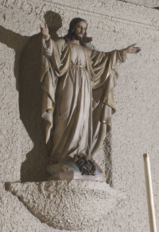
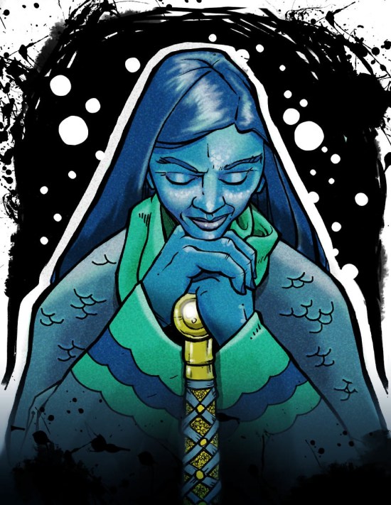
This was the best reference I had. This three-quarter view shows lots of detail, but a profile and front view would have been better.


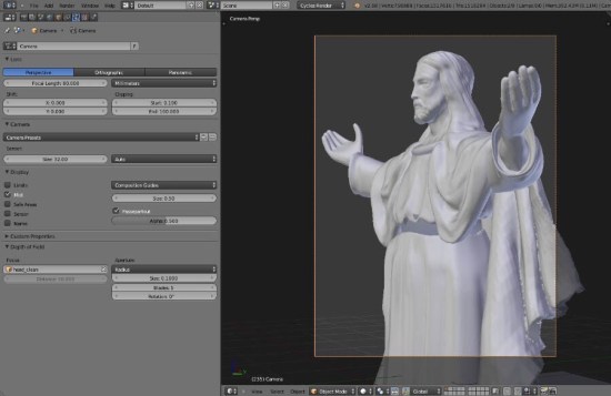
After gathering what reference material I could, I set up a file using
Blender. It was the 3D program I was most familiar with and I felt that the program’s sculpting tools would get the job done.

I started modeling the core body first. I feel this is the part of the model that is most accurate to the original sculpture. It started out as a cylinder that I then applied a few basic transforms to get closer the the type of folds I needed. Then I used the sculpting tools to add the necessary details. The arms were fairly easy to make and the hands I borrowed from a free 3D model I found on the’Net. The face was actually pretty easy for me as I already had some experience modelling the human face.


20140630-205604-75364136.jpg


The chausable* was another story. Getting the folds correctly was proving difficult, and I was running out of time. I knew Blender had a clothing simulator, and after going through a tutorial online (thank God for YouTube!) I settled on using the clothsim to help me with the folds.

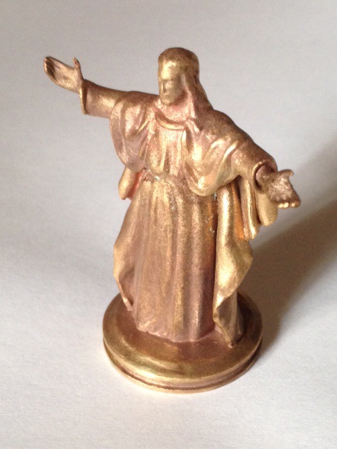
By this time, I had Andrew’s fairwell date. I only had one shot to make this work. Normally, I would have printed the model out in a cheap plastic or resin to make certain that my model was working the way it should. Even though I was working with a 3D program, I am only ever really seeing a two dimensional representation on the screen. The only way I would know for certain everything was fine would be to see it as a proper object in real life. Since I had settled on a raw bronze metal, I wouldn’t have the time to print out a plastic test model first. So I ordered the metal print on Shapeways

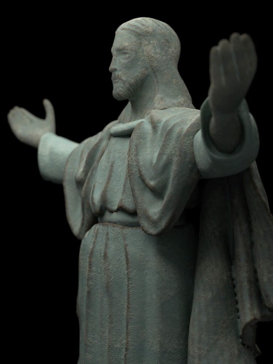
I settled on a raw bronze as I knew that the material would age over time and form a patina. Anyone who has watched antique shows or any of those pawn broker shows on A&E knows patinas are a good thing, and I thought the patina would add some character should my model prove to be slightly sub standard. I also thought the rough texture of the bronze might hide a lot of flaws as well.

When the 3D print arrived I was was generally quite happy with it. There was one flaw with one of the hands though. While it was in the proper position, it was a litle too twisted in one direction. Not a deal breaker, but it would have to be addressed should I ever make the model available for printing for the general public. As for the patina, only time will tell, but in certain light, you can already see a slight green tinge appearing. The renders in this post are simulations of how I imagine the model looking after several decades of use.


20140630-205345-75225521.jpg


I learned a lot while modeling this piece. I intend to return to this piece again once I have gained some more skill in using the sculpting tools in Blender. Maybe I will be able to get a closer resemblance to the original and maybe not rely on a clothing simulator.


20140630-210827-76107569.jpg

20140630-210827-76107621.jpg
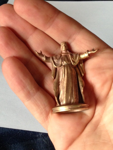
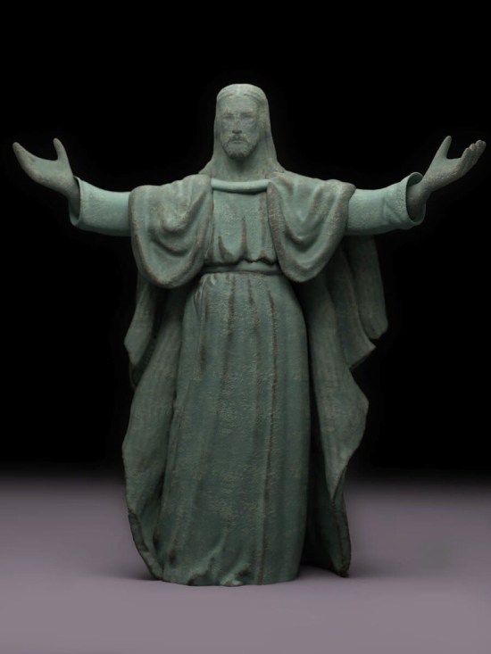
Showing the size of the final object.


*I am not much of a religious scholar and I may not be using the proper terms.

Cool Threads

For years and years, I had heard of a website called Threadless. They are a crowd-sourced site for t-shirt designs (among other things). There’s pretty descent cash prizes for the winners and they do seem to have quite a variety of very different styles of designs that get to be printed. After viewing many other designer’s submissions, I decided to sign up.

And then I promptly did nothing about it.

Not too long ago, I decided to give it another try. This time do more than just think about joining in and actually do something about it. I noticed they had a sub contest where they wanted character submissions and these character submissions (if won for t-shirt design) would get created as a vinyl toy! With my burgeon experience in 3D printing, I thought I’d have the advantage of knowing what might translate well into a proper three dimensional design. So here’s my design:

20140624-175217-64337031.jpg

I know a lot of aspiring designers and artists follow my blog, so if you are of a mind, and think my design is worth it, follow the link, and give me a vote! Act soon as voting will end in a few days. You’ll need to either set up an account with Threadless or sign in using Facebook to vote though.

And even if you don’t think much of my design, go to the site anyways and check it out. There’s a lot of clever imagery there that might just inspire you to make a design of your own! Or perhaps pick up a tee or two for yourself!

Enjoy.

The Case for a Really Great Case

20140623-205805-75485836.jpg


For Father’s Day this year I was treated with an iPad Mini with Retina display. White with 32 gigs of storage. Why 32 gigs? It’s pretty much the same price as the 16 gig iPad Air I bought for my wife on Mother’s day.

This meant I was in the market for a new case.

I have a BookBook cover for my iPhone but I was unhappy with the build quality. After a couple of months of use, the colour on the outside quickly wore away. Though the case has mostly survived the year and a bit that I have owned it. I originally wanted that type of case as it came with a side wallet. I find it great for storing business cards (either mine or someone else’s) or other bits of papers or things i pick up throughout my day. Despite being a pretty early adopter of the iDevices as PDAs I still have a habit of scribbling things down on random scraps of paper.


20140623-205805-75485657.jpg


I heard about the cases for Pad and Quill a while ago and thought about checking them out. They definitely had the style of case I was interested in, but they were pricey (and rightly so). After checking out Amazon for similarly stled cases i decided that:

A) There are quite a few cases out there that are only synthetic leather even when you use genuine leather as a search term.

B) My balking at the price was mainly my own cheapness as comparable cases were mostly similar in price. At least as far as the iPad mini is concerned. I still find Pad and Quill’s iPhone and iPad Air cases a bit too pricey.

So I decided on the Graduate series as there were a few personalizing options in terms of colour I was interested in and I didn’t need all the fancy folding options for media watching as I am still fond of the giant screen in my living room. And until now, I typed all my blog posts on my phone, so a much larger virtual keyboard is more than enough for me. So no need for a bluetooth keyboard or more fancy folding options for me! And of course, the price was right for cheap little old me!

I entered in all my info online and was pleasantly surprised when my order arrived just a few short days later. And to top it off, I didn’t have to deal with any hidden extra fees couriers like FedEx like to extort Canadians when packages cross borders. When pacakages need to go through customs, the couriers will charge a fee to act as an agent on your behalf. This can sometimes be as much or more than the package is actually worth! There are ways around it, but it is still a hassle.


20140623-205806-75486006.jpg


The case itself came neatly wrapped with a wax seal. Very nice touch! And the case itself is beautiful! Just like an old fashioned book. A nice slate grey material with red accents for the outside, and a nice deep red interior. and birch inlay that holds the iPad perfectly, though the opening for the power switch is a bit off. I imagine that may be due to the fact this case is good for the iPad Mini with Retina display and the previous model that came without? The button is still visible though so not all is lost.


20140623-205806-75486338.jpg


So far I am loving the case. and it is meeting my needs. The write up on the website had this to say about the Graduate:

It just feels … well, right. Of course, the Graduate iPad mini case is not a time machine, but once you feel the bindery cover, you can’t help but reminisce about the old university library stacks. How you’ll use the Graduate is up to you – hold it, fold it or prop it.

I never went to university, but I did grow up spending many hours pooring over my set of encyclopedias (rememer those?) and I’d say the feel is as good, if not better than those cherished old books.


20140623-205806-75486174.jpg


My only concern is the elastic that keeps the faux book closed might one day break. I know Pad and Quill offers a repair service, but I’d rather not have to go to such lengths and I am hoping to be able to use this case for a long, long time. I dont like being on the technology rat race so I don’t always have the latest greatest. I hopefully won’t need a new iPad for at least a few years, and as long as there isn’t a drastic form change, hopefully, future iPads will be able to fit this case with maybe a few shims to help stay in place.

All in all, a great case for a good price. Enjoy. [Pad and Quill Handmade Graduate Edition hard case for iPad mini Blue/Slate]

A Designer’s Guide to Flexo Printing – Part IV

Halftones


This is part of a multi-post story on flexography for the designer. You can read more of my previous posts on the subject here, here, and here.

Registration

Registration is a big problem with flexo printing. But there are quite a few things you can do as a designer to help mitigate the problem of your colours not lining up once on press.

Heavy Traps

Flexo presses typically have much greater trap lines to help with registration. Trap sizes will vary depending on the type of press, but I have seen everything from .5 pt (not too bad – similar to screen printing and some newsprint) to 1.5 pt or more! Heavier traps will have an impact on your line widths, the details you can have in your design and the type of colours you choose for your design. As an example, printing a blue object next to a yellow object will result in a very noticeable green trap line where the two colours meet up. This may obscure small type and details.


Cyan type on yellow background. It may stand out, but if this is fairly small type, this will be an issue to trap.

Cyan type on yellow background. It may stand out, but if this is fairly small type, this will be an issue to trap.

Here are two options to trap. One is to spread the cyan into the background. Makes a nice green. And is hard to read the type.

Here are two options to trap. One is to spread the cyan into the background. Makes a nice green. And is hard to read the type. Or we overprint the cyan altogether, changing the type itself to green. Better, but not great.

Or we add a black trap line to hide everything.

Or we add a black trap line to hide everything.


Another bad example occurs when blue and red are printing side-by-side. It isn’t too bad when the traps are small, but it gets pretty ugly once you get into larger traps. Having Complimentary Colours trapping to each other can be a real problem. Complimentary colours will always create ugly greyshish/brownish colours when they overlap. Good colour combinations to trap together would be yellows, reds and oranges, or greens and yellows. Blues and purples aren’t as good a choice, as I will get into next, but they work as well. Black lines can be your friend to hide unsightly trap lines, but your design may wind up looking like a kid’s colouring book if you are not too careful. Or try to keep the colours as separate as possible. No need to worry about ugly trap lines if your colours do not need to trap!

Getting out of Reverse

One big problem with bad registration is reverse type or graphics. Small type reversing out of process colour can sometimes be hard enough to reproduce when printing standard offset printing. Keeping your reverse type legible in flexo can be a nightmare. Best to avoid this altogether, but if you must, try to choose a nice open san-serif font. Serif type will fill in otherwise. And the fewer CMYK components your background colour is, the better. Reversing out of one or two colours is much easier than three or four. And check with your printer, you might be able to sub in a spot colour which will make reversing your type or other graphics better. You will also have to make certain your line widths are nice and thick. Quarter point rules reversed out of any background colour will fill in. Your printer should have information for you on just what line thicknesses you can use for reversing out of colour. Be prepared for minimum line thicknesses of 1.5 pts. or more though.


Reversing out of all process colours can be a problem with small type or graphics.

Reversing out of all process colours can be a problem with small type or graphics.


Colour Jogging

Colours that touch each other that are similar to each other in their process colour breaks can be a joy or a pain to reproduce. Take blues for example. Nice, pure blues are usually made up of combinations of cyan and magenta. If both cyan and magenta changes for each touching colour, there can be a “double image” printing effect. Seeing double may work fine for a night out at the bar, but not so much when reading the ingredients or other small type on your packaging. Only changing one of the components (like the magenta) and leaving the other one that same will greatly reduce this problem. See the illustration for a clearer example.


Colour type where multiple colours change can result in "fuzzy" type or graphics.

Colour type where multiple colours change can result in “fuzzy” type or graphics. Blues and purples tend to be the worst for this.

Here, only the magenta changes. When the type goes out of register (bottom image) you cannot tell at all!

Here, only the magenta changes. When the type goes out of register (bottom “Type” example) you cannot tell at all!


Hold lines.

Printing process colours that have been surrounded with white can be a real problem. If a colour is made up of two or more components, you can get a double image or “fuzzy” type and graphics. The fewer the components, the better. Using all four process colours is a real bad idea. Three is better, but two is ideal. Red and greens are the most forgiving, blues and purples are not great. If you have complex colours that require a lot of different process colour components, try using a spot colour instead.

If you are using process colours in this way, you may find a hold line will help you out. A hold line is an outline of colour that only uses one process colour to act as a hedge against mis-registration. If you are printing a blue colour made up of cyan and magenta, try a cyan only outline around the object. The line thickness is usually half the trap amount. This way, if the colours mis-register (and they will) the cyan outline will prevent the magenta from peeking outside the cyan, creating nice ugly, unwanted, pink shapes. See the illustrations for some examples.


A hold line in action. When the magenta goes out of registration, the hold line helps control the damage done.

A hold line in action. When the magenta goes out of registration, the hold line helps control the damage done.

Hold lines also help with reverse type.

Hold lines also help with reverse type.


Next post, I’ll wrap things up and give my final thoughts on flexo design and some links to check out as well.

Image of the Month – May 2014

May_2014


Whew! May was a petty busy month. This image was orginally going to be submitted to the @Sketch_Dailies twitter feed, but I decided against it last minute. It just wasn’t working for me. I let it sit for a while and then re-tackled it. It really didn’t take much re-work at all. Sometimes you just need some time to distance yourself from your work in order to see it for what it really is.

This is a mix of traditional pen and ink drawing with some colour added in both Photoshop and SketchBookPro.

Enjoy.

A Designer’s Guide to Flexo Printing – Part III

Halftones


This is part of a multi-post story on flexography for the designer. You can read more of my previous posts on the subject here, and here.

Everybody loves colour! The right colour choices can make or break a design. It can also drive your production guys nuts.

As mentioned in my last post, bright, non polluted colours will print the best. Dark, or muted colours won’t work as well. And light colours will often look quite a bit darker on press.

Very light colours (i.e. colours where all the components are less than say 20 percent) will most likely get much darker. Flexo presses are notorious for dot gain, but most printers should have their presses fingerprinted and will be able to compensate for most of the dot gain on press. The dots on the lighter end of the spectrum usually cannot be compensated for and will still gain on press. This makes nice delicate clouds or light pastel colours hard to reproduce on press. Check with your printer though, as sometimes this can be fixed by substituting a Pantone Spot colour into your design, rather than printing it process.  But very light colours are usually a hassle.

And now a quick note regarding PANTONE colours.

Most designers are VERY familiar with PANTONE colours. Choosing spot colours from the PANTONE spot guide is usually second nature to most designers. What they don’t tell you though is most of those handy-dandy swatch books are for Offset printing. Not Flexo. There are quite a variety of different kind of inks (and solvents) used in flexo printing, not to mention a wide variety of different substrates you can print on. All of this can affect the colour of the ink. Drastically. Or even the availability of said ink. You may even find odd restrictions regarding the use of specialty inks such as fluorescent inks. You may also find when dealing with your printer that they may have a smaller selection of inks that they would rather print from.

You may notice a trend here. I keep on mentioning that you should be going over EVERYTHING with your printer. Flexo printing is a finicky beast, quite unlike more traditional printing. The more information you can get from your printer, the better off you will be in the long run.

There are other considerations when it comes to colour choice, but that will be better covered in my next post, when I talk about registration.

Happy Birthday BASIC!

20140506-132716.jpg

Last week I discovered that the BASIC programming language turned fifty years old!

For those who don’t know, BASIC stands for “Beginner’s All-purpose Symbolic Instruction Code” and was created as an easy to read computer programming language to teach to students. It was popular way back in the day, but is widely sneered at by modern programmers. Mostly because it lacks a lot of structure and has the dreaded GOTO command that can create some fun to follow spaghetti code.

I first encountered the language when I got my very first computer, a Commodore VIC-20, way back in grade two or three I think. That would put it about 1982 or so. I remember writing a lot of small, simple programs with it. Mainly simple question and answer programs, but I eventually worked my way up to writing small text adventure programs similar to Scott Adams’ Adventureland and the old Zorkquest games. Back in the day, there were quite a few children’s programming books and I tried them all. There were books with robot themes, monster themes, and even an olympics themed one. I even explored my local library and found some really old programming gems that dealt more with simple databases and really old commands like MAT INPUT that I think were obsolete by the time I discovered them in the mid eighties.

By the late 1980’s I traded up my computer for a TANDY. Basically an IBM clone with a LOT more differences in architecture than would be tolerated today. That meant working with GW-BASIC. Slightly more advanced than the Commodore BASIC I was used to, but not by much. I built a lot of strange little programs in that. Mostly simple little games with crude graphics. Though I did build a little program that could solve the quadratic equations we were talking in my high school math class. It sounds like cheating, but in order to build a program to solve the equations, you have to know to process in solving them pretty well. Turns our parsing parenthetical mathematical equations needs the same skills as parsing two command inputs from my text adventure days.

A bit before graduating high school I upgraded my computer to a 486 PC. Can’t remember the manufacturer. But the programming language bundled with DOS at the time was QBASIC. Say goodbye to line numbers. And hello to SUBS and FUNCTIONS. Finally got some much needed structure to my programs! I even saved up enough money to buy QUICKBASIC so I could compile REAL programs that didn’t need the interpreter. Also meant I could access the mouse and plug myself directly into computer memory and access low level functions of the OS. I managed to build a small and very simple drawing program (that I hoped to use to make graphics for a game I had in mind – never happened) but the best piece of software I never made was an ASNI screen painter program. Winnipeg had quite a large and healthy BBS community before the Internet, and ASNI “graphics” and animations were all the rage. It was never finished, but I did manage to basically generate a complete menu and “GUI” system that was quite modular and could be easily used for any future program I could dream up. I use quotes around GUI as this was all in text mode so there was no real graphics. Worked out quite well as I recall. Too bad the code is lost to history, though I would be hard pressed to find something that could run the source code these days.

I took a little bit of programming in high school. BASIC and then Pascal on the Macintosh. But then it was off to Red River College and Advertising Art. While I sure use the computer quite a bit, I can hardly call myself a programmer any more. Applescript is pretty powerful (and I know it quite well) but the syntax is even crazier than BASIC and pretty verbose for a true programming language. And I just don’t seam to have the time to crack open a book on the various flavours of C that seem to dominate the programming world these days. I figure I’m the only person in the world who calls C# “see-pound” rather than “see-sharp”!

But I am glad I ran into BASIC when I did as a kid. For all it’s quirky flaws, it was a good, simple language to learn and you could actually get it to do work if you wanted to. It wasn’t just for filling the screen with “Hello World” in an endless loop! And it helped shape an otherwise artistic mind towards the analytical, giving me an edge when dealing with programmers.

So happy belated birthday BASIC! Here’s to 50 years, and hopefully 50 more years!

If anyone does know of a modern-ish version of BASIC that’s running around, leave a comment. I’d love to know about it.

Image of the Month – April 2014

April_2014


Whew! It’s been a busy, busy month. Just managed to get one finished for this month.

This one is a cleaned up and coloured image that I drew for one of the @sketch_Dailies drawing challenge. I’ve blogged about them before. The Lady of the Lake from the legend of King Arthur. Most people conjure up images of beautiful, young fair maidens. I decided on a more older, reflective woman. She is supposed to be a Lady of the Lake, not Girl of the Lake.

Drawing in pencil and then inked in markers. The image was scanned in and colour laid out in Photoshop. The bubbles and extra ink spatters were added in Photoshop as well.

Enjoy.

A Designer’s Guide to Flexo Printing – Part II

Halftones


Part II – It’s All in the Dots

This is part of a multi-post story on flexography for the designer. You can read more of my previous posts on the subject here.

As all print designers know, full colour, continuous tone images are printed using half-tone dots. The same holds for flexo printing as well.

The line screens for flexo printing tend to be a bit coarser than conventional offset printing. Most traditional print is either 133 or 150 line screen. I think 175 is the highest offset line screen I’ve ever designed for. Most of the flexo printing I am familiar with ranges from 120 – 133 line screens. But I have seen designs printed as low as 65 line screen.

With lower line screens, there will be less detail in the images produced. Often, this means that designers and illustrators wind up creating highly detailed images where most of the detail is either lost completely, or becomes just a small mush of dots.

So simpler is better. Try to keep your imagery fairly simple and graphic. It will help not only with continuous tone work, but will help with line art and other vector style artwork as well.

You will also find that halftone dots printed flexographically will tend to not reproduce as well as you might be used to. Screens of 70 percent or higher tend to plug up and light screens tend to get quite a bit darker. And over all, the dots won’t look as clean and uniform in appearance as you might be used to. Nice even graduated tones of colour can be difficult for flexo presses to create.

Minimum Dot

Perhaps the biggest problem facing flexo printing is something called minimum dot. Made from a thick, flexible polymer material, very small halftone dots on flexographic plates cannot be safely reproduced. These dots may flop over and cause the printing ink to splatter all over the place. This usually means there is a cut off point – a minimum dot. Usually, this is around 3 percent. Where I work, we have very sophisticated digitally made plates and can go down to 1 percent. I have heard of minimum dots as high as 5 percent.

This means that no colour can fade off to zero. If an object in your design have gradients of colour in them, they must contain at least the minimum allowable amount of all the colours you are using for that gradient. For example, a gradient of red to yellow must have percentages of magenta and yellow in all the steps of the gradient.

At first, this doesn’t seem like too much of a problem, but once these 1, 3 and 5 percent dots print, they often gain on press to be as high as a 10 or even 20 percent dot. That means the nice juicy orange fruit in your design that has some cyan in the shadows will look pretty green and rotten when printed. So you will want to make certain that the process colours you choose for things are as clean and non polluted by unneeded colours as possible. Reds shouldn’t have cyan in them, blues should be free of yellows, greens shouldn’t have any magenta, etc. This can make reproducing photographs quite difficult, and may require extensive Photoshop manipulation to get the colours looking just right. I could write post after post on different techniques that could be employed to correct these kinds of problems in Photoshop, but it would probably make most designer’s head explode with all the technical details. And honestly, if you have good technicians with enough time to deal with your imagery, designers shouldn’t have to spend too much time cleaning up the images. Especially if the image was well chosen to begin with.


[A] Shows a sample gradient going from yellow to red. The dark red has a bit of cyan. [B] show what happens when minimum dots of yellow, magenta, AND CYAN are added to the gradient. [C] shows a nice clean gradient with only yellow and magenta. This is preferred.

[A] Shows a sample gradient going from yellow to red. The dark red has a bit of cyan. [B] show what happens when minimum dots of yellow, magenta, AND CYAN are added to the gradient. [C] shows a nice clean gradient with only yellow and magenta. This is preferred.


When choosing a photograph to reproduce, make certain the colours are as pure and bright as possible, without a lot of really light colours (more on this in my next post when I talk specifically about colour choice). And try to get as much contrast as possible. Colour tends to flatten out when printing flexo, so the more contrast you start out with, the better. Making certain your shapes are clear and distinct will help a lot. A nice faded, blurry background may cause a lot of problems and introduce a lot of minimum dot issues that may be hard to resolve.

Shadows and Glows

Since halftone dots cannot simply drop off to zero, things like soft drop shadows and glows can become a problem. And designers just LOVE drop shadows! Or at least their clients do. Drop shadows in particular are a problem as the black used in a soft drop shadow will have to carry out in the entire background of your design! The minimum dot issue I have already talked about will prevent your drop shadow from fading off to zero percent. This will make the background a bit darker and dirtier looking. The only other solution would be to abruptly end the shadow transition, but with the dot gain flexo presses are known for, this can create a very noticeable, and ugly looking edge.

It is best to either avoid drop shadows altogether, or use a hard-edged shadow. I know, I know, 1995 called and they want their design back, but what can you do? You can use soft drop shadows if black is already being used throughout the background of your design. Then carrying the minimum dot throughout your design will not be as much of a problem.


A nice hard edged drop shadow. It may be a bit old-fashioned, but it generally works the best in flexo printing.

A nice hard edged drop shadow. It may be a bit old-fashioned, but it generally works the best in flexo printing.

This drop shadow has a nice soft edge. A minimum dot had to be carried throughout, making the white background look much duller.

This drop shadow has a nice soft edge. A minimum dot had to be carried throughout, making the white background look much duller.

This background already had lots of extra black in it. A soft shadow is easier to maintain in this instance.

This background already had lots of extra black in it. A soft shadow is easier to maintain in this instance.


Glows have much the same problem as shadows. Glows cannot fade off to zero percent, so everything gets a bit darker. This can produce some unwanted results. And resolving minimum dot issues with glows can be much harder to solve than drop shadows. Especially with a complex background. Glows are often something to avoid altogether.


In my next post, I’ll begin to talk about colour and how your colour choices will drive everyone in production crazy!