I’ve been playing around with the Procreate App or iOS tablets. It has got to be the best digital drawing experience to date. While not perfect, it has become my go-to drawing app.
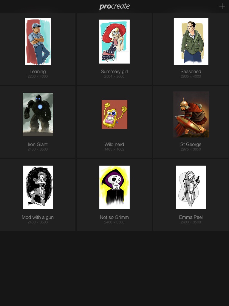
The opening screen in Procreate. Here you manage and organize your files.
When you open the App, it takes you to a gallery view. Here you can select the image you want to work with, create a new image, or import an image you have made from another program. You can import images from your camera roll, iTunes library or from Dropbox. You can also manage and organize your drawings from this screen. You can even change the orientation of drawings as well. Cool!
Once you have selected your image, you are then taken to a fairly minimalistic screen where all the action happens. Here you can chose your brushes, colours, manage layers, create selections and move objects around your canvas. There are many gestures you can use to speed up the drawing process. Most of those gestures come naturally and are similar to other drawing apps. There’s a pinch zoom, and two finger swipes for undo’s for example. The most amazing feature on this UI is the canvas rotation. You can rotate your canvas using a two finger twist. This is helpful as when drawing in real life, it helps to rotate your drawing around. You can now mimic this on your tablet. I find another benefit to this is the quality of line. I find sometimes the line gets a little shaky when daring certain angles. Not to sure if this is a hardware hiccup or me! Either way, rotating the canvas can help. I find the animation for canvas rotation to be very smooth and responsive on my iPad mini with Retina display.
There are quite a few built-in brushes for drawing and painting. There is also a complex brush designer to make your own custom brushes. You can also share and download your custom brushes. All of the brushes are available for blending and erasing as well as drawing.
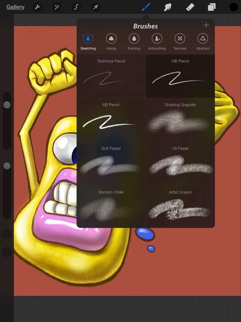
Procreate offers a very comprehensive brush engine.
You have layers to work with, but the number of layers you have available is dependent on how big your canvas is. The larger the canvas, the fewer the layers. I imagine this is a limitation of the hardware. You’re not working on a souped up desktop or laptop with a huge hard-drive and maxed out RAM! But I’m an old-timer, where you couldn’t use a lot of layers in Photoshop. The computer would grind to halt with any more than 3 or 4 layers. And the version of Photoshop I learned on, v2.5, didn’t even have layers. So limited layers in Procreate is hardly a deal breaker for me.
You have layers to work with, but the number of layers you have available is dependent on how big your canvas is. The larger the canvas, the fewer the layers. I imagine this is a limitation of the hardware. You’re not working on a souped up desktop or laptop with a huge hard-drive and maxed out RAM! But I’m an old-timer, where you couldn’t use a lot of layers in Photoshop. The computer would grind to halt with any more than 3 or 4 layers. And the version of Photoshop I learned on, v2.5, didn’t even have layers. So lack of layers isn’t much of a deal breaker for me.
As for filters and effects, there are a few. Each layer can have effects applied such as Multiply and Lighten. Photoshop users should be all too familiar with them. There is also a Gaussian blur and sharpen effect as well as some Curves colour adjustments.
I only have three complaints. The first is the built-in inking tools. I’m not using a pressure sensitive stylus, and the stokes don’t seem to quite translate from how I think the brushes should act. Thankfully, there are other Apps that I have found that can deal with line art the way I would like to work. Second, is a lack of basic shapes such as straight lines, circles and squares. Straight lines, I can always find a ruler to use, but it is nice to be able to draw perfect circles without all the extra effort! And lastly, the ability to import Photoshop files would be nice. I have quite a few backlogged images I would like to finish up, but I just haven’t been able to due to family commitments. A big reason for me getting a tablet was to enjoy time with my family and not be locked in the basement on my computer all the time. Getting those unfinished images on my tablet for completion is a priority for me.
There is a workaround by exporting your layers as PNG files with transparency and then rebuild all your layers in Procreate. For basic images, this will work. More complex images with be a problem. Though, if you are doing more complex imagery, tablet computing may not work for you.
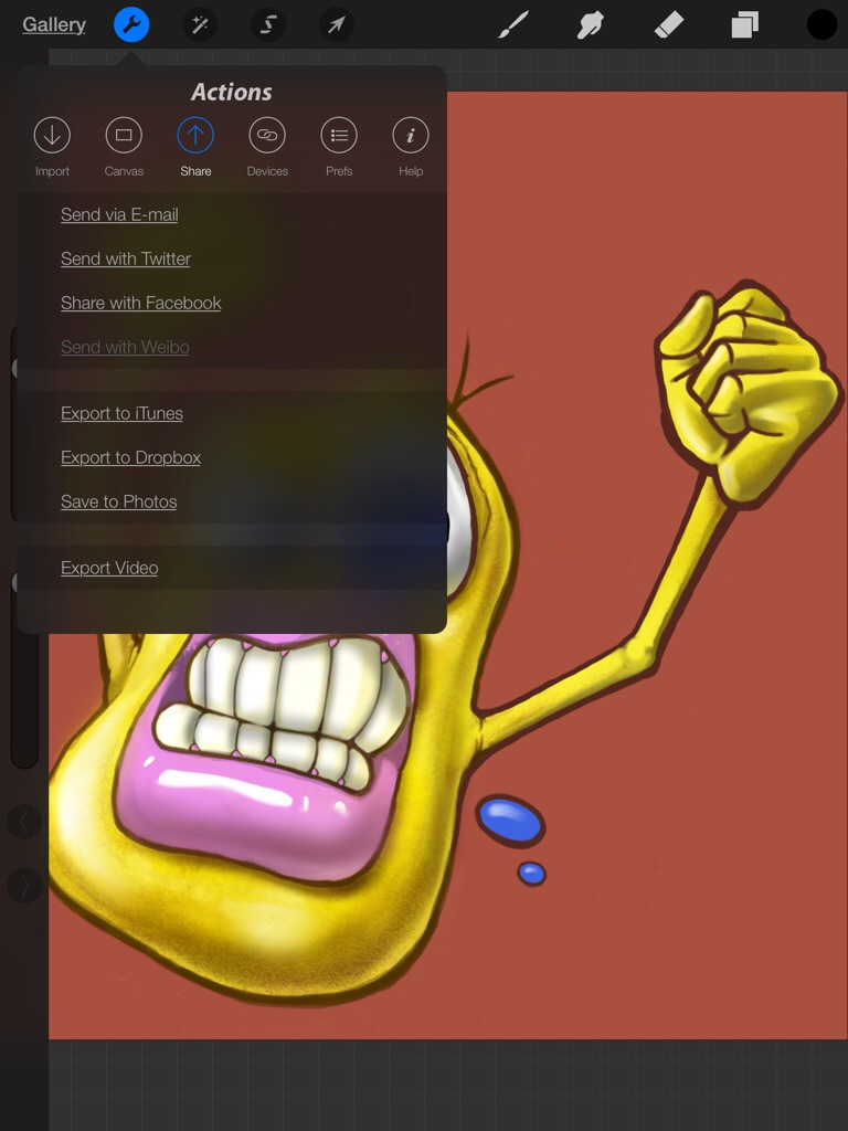
Once you have finished your masterpiece, there are plenty of options for sharing you work online. Or you can just add the image to your camera roll or Dropbox.
Enjoy. [Procreate for iOS]

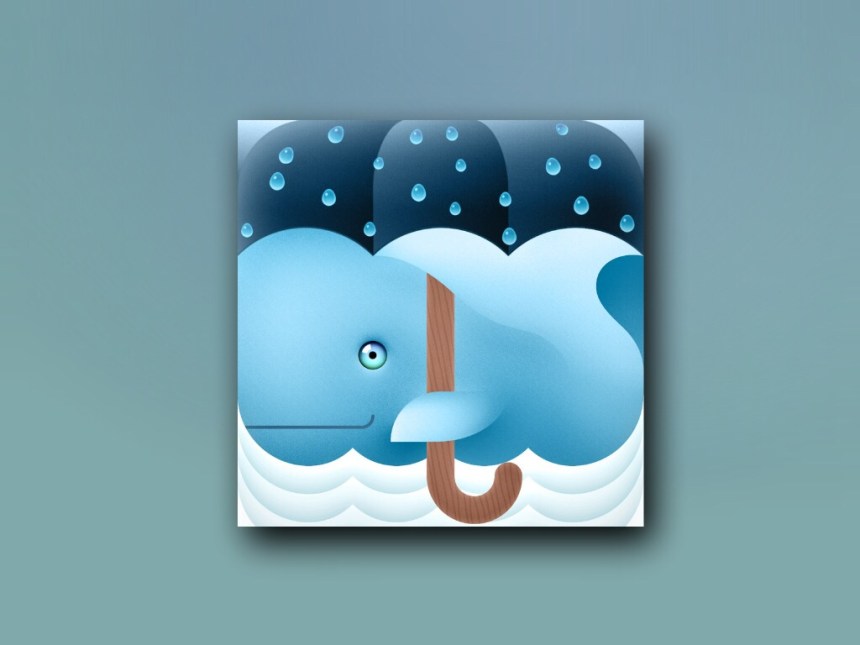
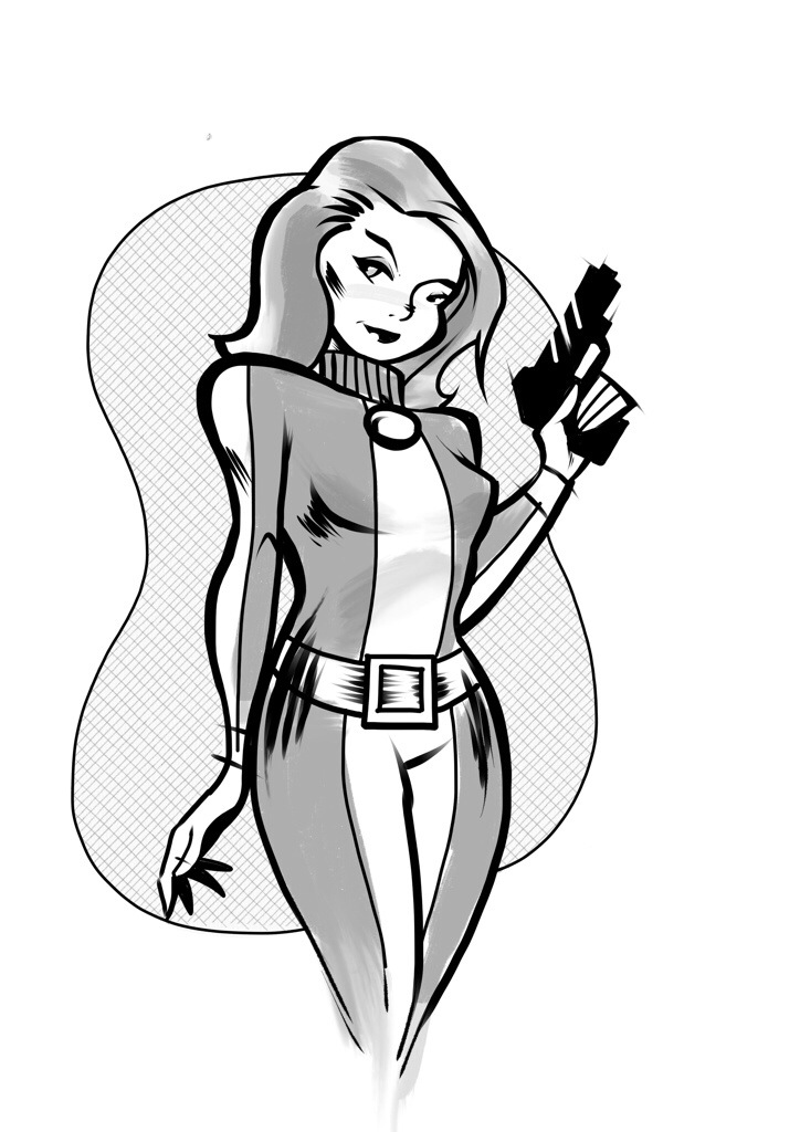
 into this…
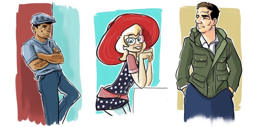
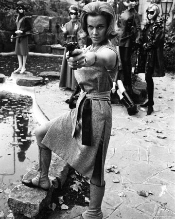
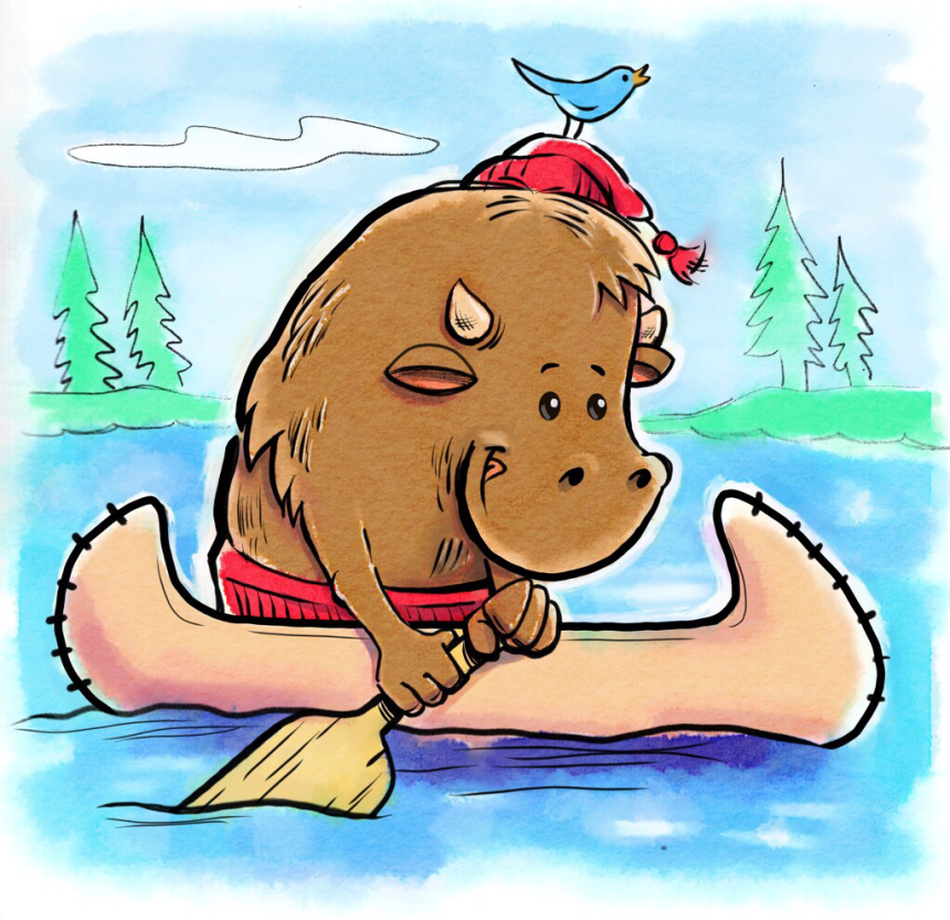