Colour of the Month, Orange

Another month, another post. This time around, Orange! Enjoy.

Another month, another post. This time around, Orange! Enjoy.
This is part of a multi-post story on flexography for the designer. You can read more of my previous posts on the subject here, here, and here.
Registration is a big problem with flexo printing. But there are quite a few things you can do as a designer to help mitigate the problem of your colours not lining up once on press.
Flexo presses typically have much greater trap lines to help with registration. Trap sizes will vary depending on the type of press, but I have seen everything from .5 pt (not too bad – similar to screen printing and some newsprint) to 1.5 pt or more! Heavier traps will have an impact on your line widths, the details you can have in your design and the type of colours you choose for your design. As an example, printing a blue object next to a yellow object will result in a very noticeable green trap line where the two colours meet up. This may obscure small type and details.
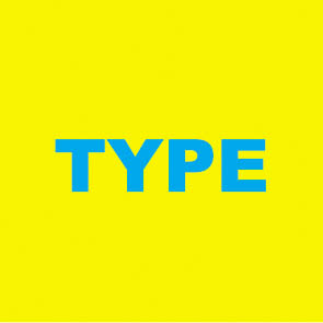
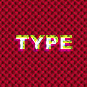
Cyan type on yellow background. It may stand out, but if this is fairly small type, this will be an issue to trap.
Here are two options to trap. One is to spread the cyan into the background. Makes a nice green. And is hard to read the type. Or we overprint the cyan altogether, changing the type itself to green. Better, but not great.
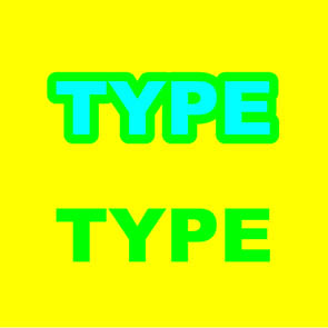
Or we add a black trap line to hide everything.
Another bad example occurs when blue and red are printing side-by-side. It isn’t too bad when the traps are small, but it gets pretty ugly once you get into larger traps. Having Complimentary Colours trapping to each other can be a real problem. Complimentary colours will always create ugly greyshish/brownish colours when they overlap. Good colour combinations to trap together would be yellows, reds and oranges, or greens and yellows. Blues and purples aren’t as good a choice, as I will get into next, but they work as well. Black lines can be your friend to hide unsightly trap lines, but your design may wind up looking like a kid’s colouring book if you are not too careful. Or try to keep the colours as separate as possible. No need to worry about ugly trap lines if your colours do not need to trap!
One big problem with bad registration is reverse type or graphics. Small type reversing out of process colour can sometimes be hard enough to reproduce when printing standard offset printing. Keeping your reverse type legible in flexo can be a nightmare. Best to avoid this altogether, but if you must, try to choose a nice open san-serif font. Serif type will fill in otherwise. And the fewer CMYK components your background colour is, the better. Reversing out of one or two colours is much easier than three or four. And check with your printer, you might be able to sub in a spot colour which will make reversing your type or other graphics better. You will also have to make certain your line widths are nice and thick. Quarter point rules reversed out of any background colour will fill in. Your printer should have information for you on just what line thicknesses you can use for reversing out of colour. Be prepared for minimum line thicknesses of 1.5 pts. or more though.
Reversing out of all process colours can be a problem with small type or graphics.
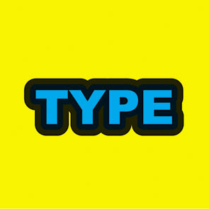
Colours that touch each other that are similar to each other in their process colour breaks can be a joy or a pain to reproduce. Take blues for example. Nice, pure blues are usually made up of combinations of cyan and magenta. If both cyan and magenta changes for each touching colour, there can be a “double image” printing effect. Seeing double may work fine for a night out at the bar, but not so much when reading the ingredients or other small type on your packaging. Only changing one of the components (like the magenta) and leaving the other one that same will greatly reduce this problem. See the illustration for a clearer example.
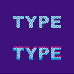
Colour type where multiple colours change can result in “fuzzy” type or graphics. Blues and purples tend to be the worst for this.

Here, only the magenta changes. When the type goes out of register (bottom “Type” example) you cannot tell at all!
Printing process colours that have been surrounded with white can be a real problem. If a colour is made up of two or more components, you can get a double image or “fuzzy” type and graphics. The fewer the components, the better. Using all four process colours is a real bad idea. Three is better, but two is ideal. Red and greens are the most forgiving, blues and purples are not great. If you have complex colours that require a lot of different process colour components, try using a spot colour instead.
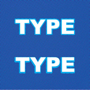
If you are using process colours in this way, you may find a hold line will help you out. A hold line is an outline of colour that only uses one process colour to act as a hedge against mis-registration. If you are printing a blue colour made up of cyan and magenta, try a cyan only outline around the object. The line thickness is usually half the trap amount. This way, if the colours mis-register (and they will) the cyan outline will prevent the magenta from peeking outside the cyan, creating nice ugly, unwanted, pink shapes. See the illustrations for some examples.

A hold line in action. When the magenta goes out of registration, the hold line helps control the damage done.
Hold lines also help with reverse type.
Next post, I’ll wrap things up and give my final thoughts on flexo design and some links to check out as well.

Shortly after I started using Evernote, I started up a notebook for just blog post topics or projects I could do for my website. Inspiration can hit at any time, and it may not be practical to jump on any idea that comes to me right away. It may be days, weeks, or even years before I start projects once I’ve come up with them. And of course when I DO have some spare time to work on something, I usually cannot remember most of my older ideas. Keeping a running list of stuff is handy to have around. If I have some time and can’t think of anything to do, just consult the list.
For this list, I started up a new Notebook in Evernote to stash all my ideas in. This notebook mainly consists of just one note. Its a big list of ideas that I can quickly jot down. Using Evernote is nice as I can use a checkbox to start off each item of my list and can then check them off as I complete them, giving me a small sense of accomplishment. My list is quite long and ever growing.
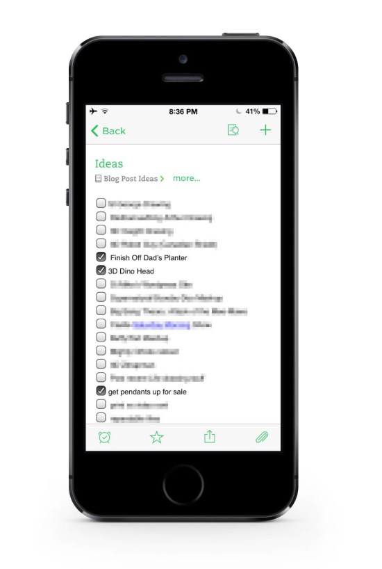
My Evernote Blog ideas list. This is just a small portion of the list. It’s quite long.
And I’m not too worried about trying to finish my list. It’s not quite a to do list or bucket list‚ as I’m not supposed to finish it. If I do, that means I’ve run out of ideas. And for a blog about creative design, that’s a bad thing.
And with it being Evernote, everything is synced to all my devices, and I can cross reference my list of stuff with various other notes and web clippings I’ve stored up over the past few years of blog reading.
This list idea could work for anyone, be it a visual artist like myself, a writer could use it for a list of topics to write about, or even cooking ideas for a budding chef to try out.
Simple but effective. [Evernote for iOS]
For those interested, the iPhone mockup I used for this post came from here:
www.pixeden.com/psd-mock-up-templates/iphone-5s-psd-vector-mockup
It’s a free download and was quite nice!
Image scanned from some really old reference material I inherited from my grandfather. Source unknown. Circa the 1930s or 40s.
In my last post I’d mentioned that I would describe the way I managed to get my swipe file organized. I first setup a whole bunch of different notebooks I could move everything to. I tried to keep the different notebooks as different in subject matter as I could to avoid as much overlap as I could.
The main category I set up was “Design”. I was originally going to call it “Graphic Design”, but I felt that graphic design was a bit too limiting as my interest in design also leans towards product design as well.
I also have notebooks set up for Illustration, Tutorials, Web and Technology, Typography, Quotes, and Photography.
I hesitantly set up a “Misc” notebook as a catchall to hold anything that didn’t fit in any of the other categories. I’m not a big fan of this. Open folders like that tend to get abused and can make it hard to search for stuff afterwards. But I knew there were a few things like recipes and workout tips that I have starred in the now defunct Google Reader that wouldn’t really fit in a designer’s swipe file.
As a side note, once it was getting close to Google Reader’s termination date of July 1st, 2013, I checked out all my data and used the instructions found here to move all my starred items into Evernote. The instructions found here put everything into a local notebook. I then proceeded to move everything to the synced notebooks so I could access these any time I wanted to. This forced me to buy a Pro account in Evernote so I could move all those megabytes online. Hopefully good things will come of that!
Once all my digital files were all sorted, I set about getting as much of my analog swipe files stashed away into Evernote as well. Evernote has a camera feature built in, but it takes files at full resolution, and I don’t need anything quite so ambitious. So I used the app, FastEver Snap. All it does is take photos at a user specified resolution and upload them to Evernote in a specified notebook. Easy peasy.
I probably won’t do much in the way of tagging. The only main use I think I’ll have for tagging will be to keep track of notes for specific projects. Usually, all I would do is just browse through my swipe file and pull out whatever I think is relevant to the project at hand. Tagging items with a project name rather than making a notebook for each project would then make it easy to find the relevant data, and will keep down the number of notebooks to a minimum.
So here’s two screenshots from my iPhone, showing the before and after.
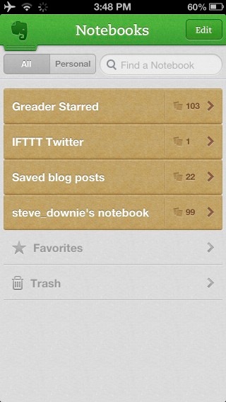 Before. A simple, but disorganized mess. Good luck finding anything in there.
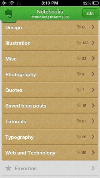 After. Looking much better. I now have a chance to find stuff. Browsing will be easier too. [Evernote for iOS]
Wikipedia’s article on swipe files.
More on Evernote can be found here.
