Graphic Design and Illustration.

Posts from the ‘Illustration’ category

And Now For Dads Who Kick Butt! (Or At Least Try To)

On Mother’s Day I drew a little something to celebrate all the Moms who I have managed to train with either online or in the rare times in-person training was allowed (with restrictions) via local public health orders. As a newbie it’s been challenging. Training with a youngster (who sometimes shows his Dad up) even more so. But I am enjoying learning Karate as a more mature person, so hopefully I will be able to keep things up when things get a little better. Fingers crossed.

Eagle-eyed people will notice there’s a few things… different about the background on this one. There will be an update that should totally explain what exactly I have in mind. Stay tuned!

For Moms Who Kick Butt!

Been training with a bunch of moms (and a few guys, some of whom are dads, but this isn’t their day, ours is coming up) so I’ve been toying around with this idea for a while. And pretty much ran out of time today. So here goes.

I don’t normally draw this way. I don’t really get a lot of projects that come my way where I get to draw in trendy editorial-style styles. But it was quick to do. As I understand it, that’s why it’s trendy. Hopefully I got the pose mostly right. This style tends to be rather simplistic, so getting the intricacies of Mae-geri might get a little lost. And while there’s a slim. but not zero chance one of my sensei might come across this post, I’m not really all that interested in all the push-ups my messing this drawing up might cost me. Fingers crossed!

So here’s to all the karatekas, yogis and BJJ professors that put up with klutzy, southpaw me! And to any other women out there who can kick some ass! Enjoy!

Sketchy Girl


Remember this sketch from my Fude Pen Nib review? I actually had some time during all the craziness to quickly drop some colour in this one. Nice muted palette, Tried keeping the colours very loose in keeping with the look and feel of the original sketch. All colour done digitally in Photoshop.

Enjoy!


My New(ish) Drawing Pen


Over the holidays, my kids got a hold of my art supplies and managed to demolish my favourite brush pen. It was a Kuretake No. 8 Fountain Brush Pen. Not an expensive one, but it was next in line after the ubiquitous Pentel Brush Pen as my favourite pen. This was over the Holiday season, so I decided to treat myself to a new pen.

I picked up another Kuretake, as I really really like it as a brush pen. If I want some fairly consistent lines with a little bit of character, this is my go to pen. If I want something with a lot more character, it’s back to basics with the Pentel. But what else would I get? The Kuratake, while a fine pen, is fairly inexpensive. I could justify another pen for the right money.

Thumbing though my Instagram, I noticed someone mentioning their love of the Sailor Fude De Mannen pen. Fude pens are strange ones. It basically looks like a standard calligraphy dip or cartridge pen that’s been broken backward. It’s supposed to look that way. It mimics the look of a fude brush for Chinese calligraphy. So you find them mainly in China or Japan. Here in the West, they get used a lot by urban sketchers. With the funky bent nib, you can get a bunch of different line weights depending on how you hold the pen. Why carry 3 or 4 pens around when all you need is one?


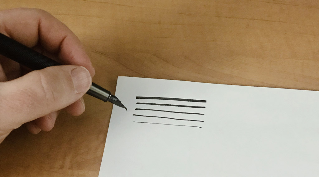
Different lines weights can be achieved by holding the pen in different ways. Even holding it upside-down!


The Sailor pen wasn’t really available at the time. And it would have cost three times the price of the pen to get it to arrive even close to the holidays. Until very recently that seemed absurd. With the delays in today’s shipping it almost makes sense. Almost.

Instead, I found something cleverly called Black Forest Fountain Pen Bent Nib Metal Fude Pen (Fine to Broad Size). It seems this came all the way from China (as do a lot of fairly cheep fude pens). I didn’t really piece that together until it arrived. And fairly timely. Thankfully, the pen seems to be fairly well made, if a bit on the heavy side for me. As of this writing, this particular pen now seem unavailable. But other fude pens can be had.

I love it. The pen has a bit of flex, though still a little stiff, so the stokes can have a bit of character to them, with variable thick and thin lines. And with a little bit of getting used to, a nice variety of different overall pen strokes can be made. From very thick lines to very scratchy, thin lines (you have to hold the pen upside-down for that). My one complaint other than the weight, is the amount of ink this pen puts down. It is a lot. And according to my research, I am not alone in that assessment. Fude style pens like to put down a lot of ink. Thankfully, it came with a converter, so filing it with my ink of choice was no problem. I do find that the very thickets lines tend to break up a bit, so if you are looking for a clean, thick line you either need to be very careful with your lines, or go over them with a finer pen for some clean up afterwards,


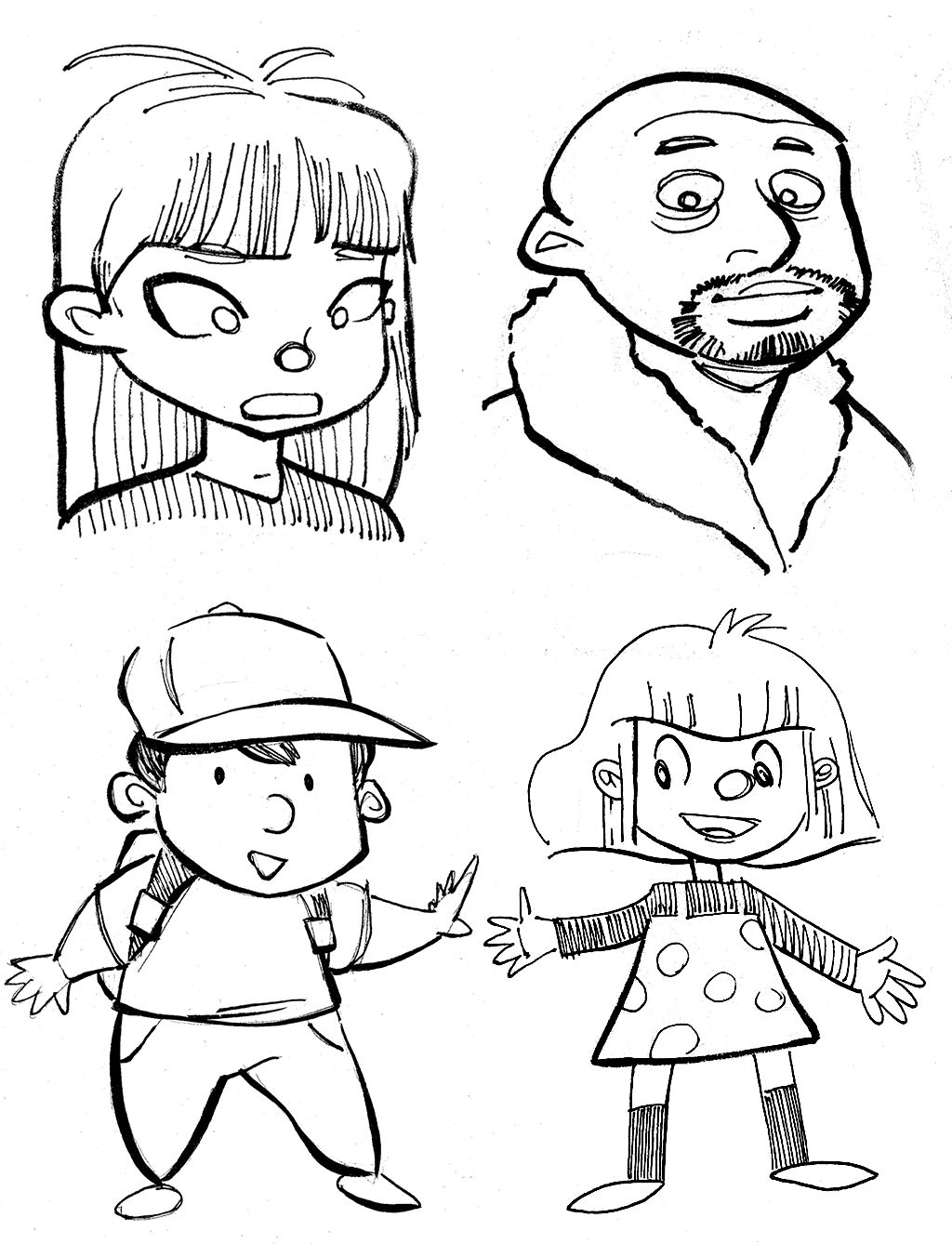
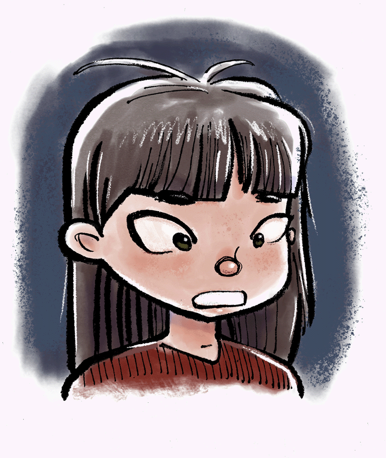
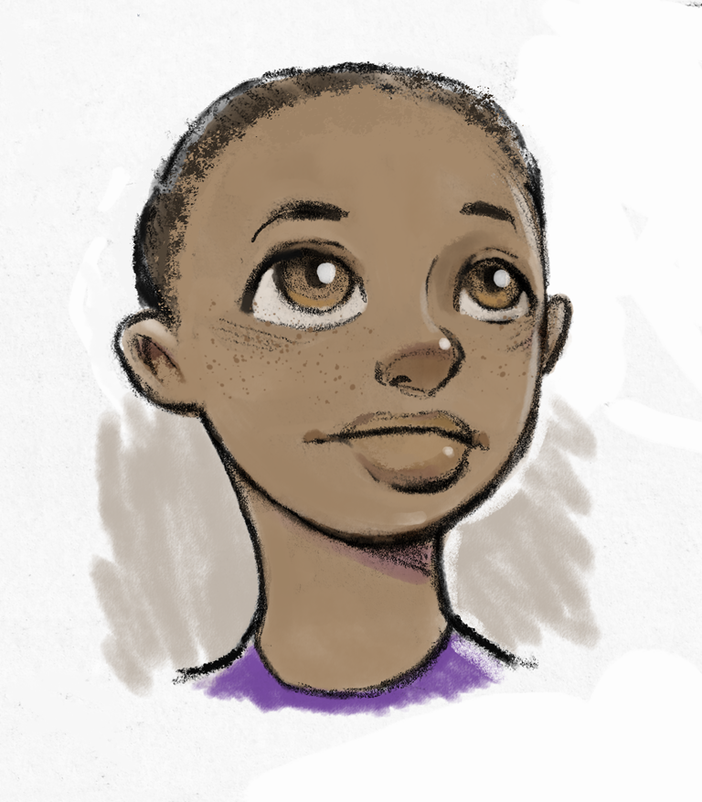
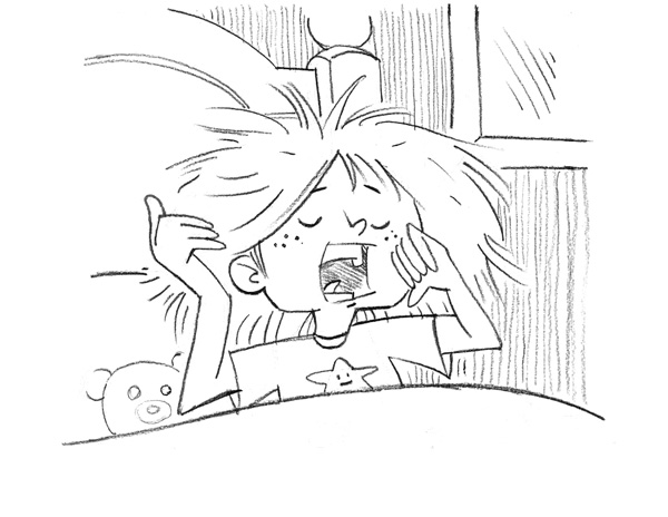
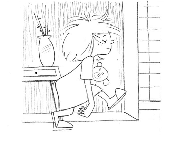
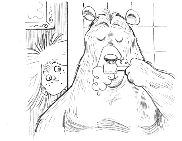
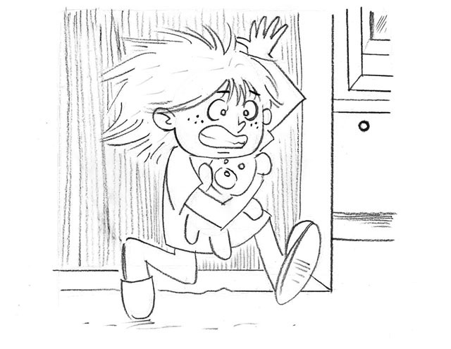
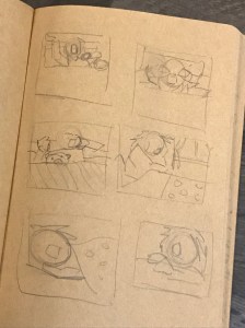
Some quick samples of sketching with the dude pen. Note, these were some fairly small skates on some rough paper. Hardly finished work, but I like some of these characters!


And also please note. A lot of very cheap fude pens are made in China. Westerners freak out when they see these and then think they can get a $4 dollar fountain pen. It seems these are basically the equivalent of a cheap Bic or Papermate pen. So pen enthusiasts tend to be disappointed in them because these pens really aren’t going to be very good writing instruments. This particular pen I bought was around $20 Canadian, and the Sailor is generally priced around the same. I would consider that to be the base price for a decent pen like this. They also go into prices straight into the stratosphere, and are well beyond the grasp of this humble Graphic Designer.

I’m looking to do a lot of fun work this pen!

Enjoy!

Mystery Girl


This sketch was inspired by a fun incident at my son’s school (remember schools?). Anyways, when my son was in kindergarten, they had some of the older kids act as mentors and read to them. Sone day when I dropped my son off to school, this much older girl came out of nowhere and gave my son a great big hug! Somebody was quite embarrassed. Not sure if it was the hug, or that his old man saw the hug, that caused him to turn bright pink. Somehow I thought this was going to happen when he got older.

Oh well. This was a quick pencil sketch done with a very blunt 6B pencil. Scanned into Photoshop with some quick digital colour and some touch-ups. Enjoy.

Grrrrrrrrr!!!!!!!


Big bad Brenda made it easy for people to social distance from her, long before it became necessary to do so.

This was fun little sketch I did a while back. Was originally a quick pen and ink sketch, but I gave into my self-doubt about traditional techniques and re-did the whole thing digitally. First in Illustrator, then in Photoshop. A nice, fun, loud palette of colours along with a hint of texture. And maybe just a hint of the frustration we all share right now.

And please, people like this who are angry and mean all the time, often are just afraid and maybe lack the tools to process it better, or just need some guidance on how better deal with their own emotions. And they can also pack a wallop, so please, approach with some caution. Enjoy!
 

Drawcember 2019 – Week 1 Update

Drawcember

So it begins. Started off pretty good, but with some Christmas shopping and stuff with the family, I managed to dip into the handful of cheat days almost right away. eagle -eyed followers will notice that a few of the images may be slightly different than what I posted to other social media. I reserve the right to make quick alterations to drawings as I see fit after the fact as this is hopefully going to be a portfolio piece when I am totally finished. Enjoy


Drawcember 2019 – The First Day

Drawcember

So here we go, Drawcember 2019. Everyday, on my Instagram site (and mirrored on my Twitter page) I will be posting quick snaps marked as #Drawcember2019 with a very brief description as to what’s going on. Similar to this picture here:

And what a better way to start off my Drawcember art challenge with this little one’s early start to the day.


At the end of each week, I will post a recap here where I will be posting better scans of each image. As mentioned before, these are drawings only (hence Drawcember) so basically only dry media – no paints or washes. And these will be black and white only. Be easier for me to quickly put something together in the evenings after the kiddos are in bed.

And no real prompts. At least for me. This is an excuse to beef up the Kid Lit portion of my portfolio by drawing out an entire picture book this month. And to also see just how viable doing a drawing challenge is in what is a pretty busy time of the year for most, me included.

And as I pointed out before, I did thumbnails of just about everything I’m drawing the previous month. Here’s an example:


I would show something larger, but they are hardly with the effort. They are only there to work out some visual problems before I spend time drawing something out.

So finger crossed, and enjoy!


Fantasy Map


As a kid, I loved maps. I especially liked the ones found in my favourite fantasy novels. The first one was the Hobbit (of course) with many more to follow. I loved to trace them out, and try and track down extra information about what would lay beyond the boundaries of the map. Middle Earth was especially bad for that. I’m not sure exactly how many versions of the Book of Lost Tales I slogged through trying to find out more of what went on beyond the boundaries of the epic The Lord of the Rings.

Anyways, I gave a ty at creating a map for a fictional boardgame. Sort of a Risk clone. The map itself was generated over that this site here. I used it pretty much as it. I did get rid of most of the cities and just kept one for each capital. The website produced an SVG that mostly opened up fine in Illustrator. It’s still pretty much vector art. The exception being the parchment texture in the background and the faked in mountain texture. I reset all the type as I seem to have some different ideas as to what is acceptable type design compared to most computer programmers. Oh well. Enjoy!

Lil Orc


In the midst of battle, around the carnage, and just underneath all the destruction, there’s a cute little orc who just wants to say hi!


This is a fun little drawing I did quite some time ago. Created after studying up on some of my daughter’s toys. Eventually, I scanned this into the computer (it was a pencil sketch done in one of my myriad sketchbooks) and had the colour dropped in on Photoshop.

I MIGHT one day see if I can get her into 3D. Would be a definite challenge based on my skillset, but you never know! Enjoy!