Car – Honda Insight

A vector illustration of our car, a Honda Insight.

A vector illustration of our car, a Honda Insight.

A visual experiment of mine. I wanted to create my own version of a bitmap style font. A real minimalist challenge in reducing all the letterforms into their most basic shapes and still have them identifiable.
Seems the website links under the main menu had gone missing for a while. That’s actually been a problem with this site from the get go. Could just be my lack of familiarity with the software, but that seems to be my only gripe regarding WordPress.com. I can’t really say I’ve noticed the same problem with the standalone version of the program. Or maybe it’s a problem with the theme I’m using? Will have to investigate further. So you can now see a few website I’ve helped create, just to prove I’m not a total noob at site design (just mostly).
Kinda sad, really. I’ve been on the interwebs in one form or anther since 1994. And that’s all I’ve got to show for myself (at least for now). Though to be fair, most of the websites I developed in the deep dark past are all now just fond memories.
So here’s a slideshow of a whole bunch on images from my mostly on again/off again affair with the WAG’s life drawing program. Mostly black and white stuff using conté crayon, but a few colour pieces as well. Most of the pieces range from 10 minutes to half an hour. Though there are a few quickie gesture drawings and some longer poses to round everything out.
This is only a small sample of the some 200 odd photos I took the other week. Had to purge since it was taking up just too much space at home. Had some pretty interesting recycling this past Tuesday.
And in case anyone ever wonders how a married man gets away with staring at naked women (mostly) once a week, keep in mind, my wife is a photographer (she knows the drill), and I’ve been told I HAVE to be outta the house once a week for girls facial night. Apparently, her and Jessie’s (our female cat) pores are in dire need of cleansing. So there you go.

I was asked to design both a book and a website for Carl Harrison, a local, first time author. He had an idea for an image for the cover, but that was about it. He was quite open to ideas and was very generous in his trust of my design skills. A rarity in this business. I think the cover turned out quite well, and I know Carl was very pleased with the end result.
Came home from life drawing tonight only to find out Steve Jobs passed away. It’s sad, but not exactly unexpected. He’d been looking like a human skeleton for a few years now. And pancreatic cancer is pretty nasty.
Most people have wondered what happens to Apple next. I wonder about Pixar. Steve was always in the shadows of Pixar rather than the limelight he thrived at in at Apple. But Pixar is just as much Steve’s as Apple was. Only time will tell I guess.
I’ll assume this will be THE topic of conversation among creatives and tech people alike.
I’m going to try and challenge myself to put together one personal illustration a month until I get sick of it. Has to be either digital or traditional media. This very first one, is a digital piece. Not too long ago, I had to do a series of lottery ticket designs based on fantasy/mythological creatures. They turned out okay, but there were so many time restrictions, odd marketing demands to follow, not to mention a few technical restrictions, that I felt I could do better. So I set about to re-create one of the images as if I were the boss (and didn’t have to worry so much about reproduction restrictions.) The result is below:

So I read in the paper today (yes I still get the Saturday paper) and discovered that Foreign Affairs Minister John Baird did some rather surprising things on his business cards. For some reason he had the Canadian coat of arms gold embossed, removed the Canada logo (and what looks like the recycled logo as well), took out reference to the Lester B. Pearson Building and had the card in only one language.
As a designer, I’m pretty upset about this. Canada’s visual identity is rather hallowed ground amongst the Canadian design community. Canada’s visual identity is one of the most recognizable in the world. Not to mention removing all reference to Canada on the Foreign Affairs Minister’s business cards is rather odd. And the one language. Like it or not, (and as a typesetter I do not) Canada has two official languages and as a representative of the country, I think the business cards should reflect that. Want to change the policy? Fine. Change the policy and then change the card.
There’s other things I could say, like the extra cost for the gold emboss, the dirty pool politics about removing the name of a building that was named after a Liberal PM (Baird is a Conservative) but I won’t. I’ll leave that to others. I’m just saddened that once again, someone in power just craps all over good design strategies and sends out rather mixed messages in the process.
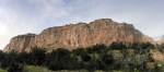
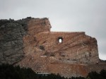
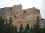
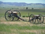
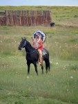
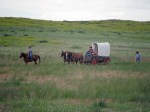
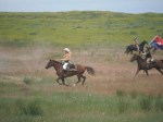
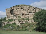
Fall is upon us. Finally got around to looking at our pictures of our trip the the American West. These are a sampling of my pics, with the one obvious exception that belongs to my wife. Hopefully, these, along with some more from my wife, should make a lovely photobook that I hope to have completed latter this week. Then off for printing!


Despite the current rise in popularity in books distributed electronically, there seems to be an almost complete lack of tools to create publications for these eBook readers. InDesign has some tools available, but it still seems that you’ll want to “break in” to the ePub (or Mobi file for that matter it seems) and edit away HTML and CSS. Fun.
It occurs to me, that a carefully constructed web page has a better chance of being converted to either of these formats than an InDesign file. I may need to dust off my old PDF to HTML conversion notes and see what I can dream up…
