Graphic Design and Illustration.

A Bunch of Coloured Line Arts


Female Astronaut


Last October, I participated in the Inktober challenge for the first time. Here are a few of the images with come digital colour dropped in. All of these were coloured on the iPad with some minor color tweaking in Photoshop. Seems purples come out rather strangely once on my computer screen rather than my iPad screen. Not too sure if that’s an iPad thing or a problem with Procreate’s PNG export. Enjoy.


Guy Walking Evolved Dinos Film Noir Guy Super Hero lizard scarecrow The Maxx girl walking

Image of the Month – January 2015

dragon


Back at the end of 2013, I created a drawing challenge for myself called Drawcember. The result was a bunch of pencil or ink drawings. This dragon sketch was one of them. I then brought the pencil into Procreate’s iPad app to colour it. A bit of texture was then added in Photoshop afterwards. Enjoy.

A Feast For the Eyes!

Like most really great things, I discovered this place quite by accident online. I believe I was poking around the Red River College web site and found a link to their webpage.

Tiny Feast is a small stationery and supply store located in the Exchange District in Winnipeg, Manitoba, Canada. It boasts a nice selection of journals, cards and pens along with a bunch of other small room decor tchotchkes that would fit well with the modern home office.

Originally, I wanted to go there to see if they had any iPad Air cases that I might not easily find in your average big box stores. It also meant I needed to find a way to sneak away from my wife (as the case was to be a Christmas gift). I had thought I might be able to sneak away with my son in tow as it was a pretty easy bus ride from my home. Good thing I found some time to go without him as just about everything in the store was just the perfect height for my son. It was a pretty expensive trip without him, I can only imagine how much it would have cost to replace the stuff he would have accidentally broken or refused to give up. And he’s a pretty well behaved kid.

While I did not find any cases, there was a really great selection of journals, thank-you cards, pens, pencils and even a few interesting wall prints as well. Lots of stuff I hadn’t seen anywhere else.

The store was well laid out with lots of room to run around. Making me further glad that I left the kidlet behind. And since it was in the Exchange District, it was in a nice old building with lots of wood finishes and character appeal.

Despite not having what I was looking for, I did manage to pick up a few stocking stuffers and a other supplies as well. I even snagged a quick something for myself while I was there. They had these cool little wooden boxes filled with stamps of letters made out to look like hot metal type a typesetter would have used in the 19th and early 20th Century. Very cool. And it beats searching for eBay or Craigslist for old hot metal type or purchasing from the few foundries in North America who still make the stuff. Yeah, type people are weird.


As you can see, some of the letters have already been used!


Now if only they start looking into Japanese brush pens, Pitt pens or these watercolour brush pens I recently discovered,. If they do, they might find a more regular customer in me!


Tiny Feast Website:
http://www.tinyfeast.com

A Very Merry Art Trade – Image of the Month for December 2014

VMAT_2014


This year I signed myself up for VMAT or a Very Merry Art Trade. It is run by a couple of illustrators that I follow on Twitter. While my schedule as of late has been pretty hectic, I figured I could find some time.

The premise is simple. You sign up via email before the selected due date and people are then randomly paired off. You have until Christmas Eve to get your piece of art into the mail. The whole process is run through a website cslled Elfster. It basically runs Secret Santa gift exchanges for groups. You can setup wishlists and ask questions to your person to see what they want for Christmas if you want. Or you can just do whatever you want to do. I chose the later.

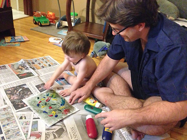
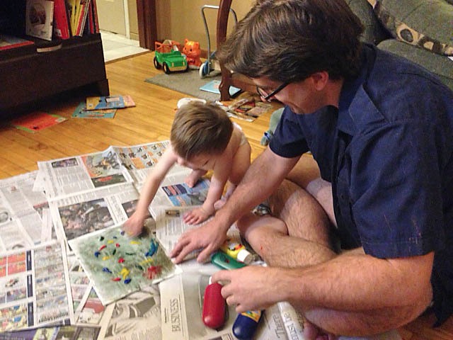
The last art swap I participated in I managed to enlist the aid of my son. I figured this one would be no different.

I quickly and very lightly put in some washes on canvas paper using Prussian Blue and Cadmium Orange. This created a nice neutrally grayish green ground. And then I broke out the finger paints and let my son have at it.


photo 1


This was the painting before my son did his handy work.


photo

photo 2


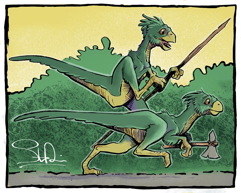
Then I went out and quickly (perhaps too quickly) sketched out what I was planning to paint on a separate piece of paper. It seems I keep settling on a wild life theme for art that I randomly send out to people. I later transferred the drawing to my pre-painted background.


photo 4
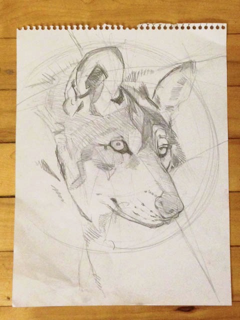
A picture of the initial sketch. I’m kicking myself for not taking any more process shots. It was usually late when I got the chance to work on the painting and I was rather nervous of it’s outcome.


After laying out some white, I started out by drawing out the basic shapes and some shadows using Paynes Grey and Prussian Blue.

Side note: I tend to not use oil paints when painting as I do not have a sense of smell (not kidding) so playing around with turps makes me a little leary. For this painting I used primarily acrylics.

A lot of changes were made from my original drawing. Mainly, the snout was too long.

Once the main highlights and shadows were established, I then stared working in the colours. Using mainly Red and Yellow Ochre, Prusian Blue, Raw Umber, Paynes Grey and Titanium White. Darker details were added using a combination of Mars Black and Raw Umber. Gold paint was added in a few spots for effect.

Afterwards, I blotted a lot of darker colours around the edges of the artwork to create a vignette. This was at the urging of my wife, photographer extraordinaire, who felt the focal point had to be stronger. Then I used a tea wash to help artificially age the work. To make the wash dark enough, I used one half cup of boiling water and three tea bags. This wash was then painted on in little dabs all over the artwork avioding the main focal point of the painting.

Once everything was dry, I used a white gell pen and my trusty Pentel Brush Pen to refine a few small details and sign the artwork.


Final


Hopefully the work will be well recieved by my recipient and it will be in one piece when it arrives. I am also anxious to receive my art gift as well. I will post once I get it.

It is possible that my illustration may go up for sale as a print in the new year. I guess that means I’ll have to come up with a name for this guy. Summer Wolf perhaps? Or just maybe Fred? I’m terrible with names. We shall see…

Enjoy.

Image of the Month – Movember 2014


So this past month, unlike many men, I did not attempt to grow facial hair to raise the awareness for men’s health.  As I am rapidly approaching the age where Movember is concerned with, my facial hair is very salt and pepper at best. I barely act my age, I certainly don’t need to look like it either.

So this month I inked out an old pencil drawing I did a few years back instead. Inked on my tablet with Adobe Ideas App. Enjoy.

REPOST: My silly idea for a Star Wars movie

Poster RGB


Since the trailer for the new Star Wars movie is now out, I thought it might be a good idea to re-visit an old illustration I did for my wife’s Christmas present almost ten years ago. Looks like I was on the right track for a few things and totally off on a few others.

So lets start with the stuff I (sort of) got right.

Big focus on a Stormtrooper. The new trailer pretty much opens up with a shot of a very worried and frantic Stormtrooper sans helmet. My poster is mostly a Stormtrooper’s helmet. The only other person we really see in the trailer (except the rolly-polly droid and the back of dark, scary dude) is a female. And my poster has a female lead. In my case, it was an attempt to put my wife (then girlfriend) as the hero of my fictional 7th movie. And my poster has Tie-Fighters and X-Wings and so does the new trailer. Considering this is a Star Wars movie, that was a pretty safe bet. Ditto for talking about the Light and Dark side of the Force. This IS a Star Wars movie after-all.

And now for the big differences.

The setting. My poster would most likely take place fairly soon after the original movies would have ended. I had imagined maybe a year or two. I have a tough time thinking the Empire would last another 30 years or so as the new trailer implies. The planet I have in the backdrop is a totally new world, the one in the trailer sure looks a lot like Tatooine to me. Though rumor has it, this might be a different desert world we are looking at. And I don’t have a totally kick-ass shot of the Millennium Falcon doing battle with Imperial Tie-Fighters in my poster. And no light sabers in sight on my poster. I’m very interested in how that cross guard will work in the new movie. Right now, it looks just as dangerous to the wielder as it would be to an opponent.

And of course my poster is totally fictional. And unless something goes horribly wrong, we will have a very real Star Wars movie to see in one year from now. And I didn’t think I’d say it, but I am now very intrigued to see it.

Enjoy.

Year Three in Review

Untitled


It’s that time of year again.

Where I enter in a years worth of blogging into Wordle.net and see a great visual representation of my language use. Now this year the blog is really shaping up. As you can see, design and drawing are getting really large (therefore used the most in my blog) and even more interesting, much of the rest of the words seem pretty similar from year over year. I guess this implies that I must have some sort of writing style.

The other two word clouds can be viewed here, and here for comparison. Enjoy.

My First Inktober

Full Inktober_Smaller


As mentioned in my previous post, I participated this past October with Inktober, a month long challenge to create one traditional (ie: non-digital) ink drawing a day for the entire month of October. I was going to be pretty busy with other personal things and my work likes to keep me pretty busy, so this was going to be quite an interesting challenge.

To speed things up, I decided that I would try and draw people as they walked by the large bay window of my living room. While an interesting idea, it proved somewhat difficult. I would be out of town for one weekend and towards the end of the month, it was getting pretty dark outside pretty early. Tough to draw people you can’t really see. So weekdays I tried my best to draw passers by, and weekends I was left to my own imagination. The same went for days I was either too late in getting home, or too busy with other things before the sun set.

Some drawings were more successful than others. I took this opportunity to experiment with certain styles. Since I only had limited time with each drawing (most were completed within one hour) I didn’t really have the time to anylize my work the way I probably should. When I was being more true to my usual style of drawing, I think I was consistently more successful. When I was trying things out by borrowing things from other artists I admire, I was less so.  Which is odd as I consider one of my strengths to be my ability to match styles. This has been handy with me as an illustrator in a small market where I can draw what is needed for the job rather than seeking out jobs that would fit my style.

I’ve compiled all the drawings into one large image. You may click on the image at top to view a much larger image that will have a more detailed view of each picture. I will most likely be cleaning up some of the more successful images and dropping in some colour for future Image of the Month posts in the new year.

Enjoy.

iPad Quick Tip

20140623-205806-75486174.jpg


I’ve been pretty busy lately, therefore there haven’t been many updates. I participated in Inktober this year, and it kept me busy. I also tore out old carpeting in my basement that had been all glued to the cement floor, and that ate up all the rest of my free time. But I do have a quick tip to share.

While participating in the Inktober challenge, from time-to-time, I needed a light table to rework preliminary drawings that I mostly screwed up on. There’s no undo in real life. I don’t own a light table any more (though, I once did own a Mickey Mouse drawing table for many, many years as a kid), and I find the small dinky ones you can buy in art supply stores a waste of money.

At my first job, we had these huge light tables the size of standard (grown up) drawing tables. And unlike other large light tables you would find in pint houses and other production oriented graphic arts places, these light tables could pivot to just about any angle, making it easier for drawing. They were great! And don’t ask me where they got them, as they were specially made for us. Though I was pretty certain I found someone selling the exact same model we had on Kijiji (sort of a cross between eBay and Craglist for Canada) so it is possible that someone out there makes them. No matter, as I certainly don’t have the space for such a huge beast.

So with no light table, I had to improvise. Enter my iPad Mini.

I just set the screen bightness to maximum and opened a blank page in Safari. And presto! One quick and dirty light table. Worked pretty well too. Just be careful, even with two sheets of paper between me and the screen, I was still able to move things around on the screen pretty easily.

Oh, and try no to spill any ink on the iPad. Probably not a good idea.

I also assume this would work with just about any tablet that has a bright enough screen setting.

The Good, The Cheap, And The Fast

Infogaphic


Here is some advice I was once given by a mentor I worked with a few years ago.

The advice has to do with dealing with trouble clients. Some clients can be pretty demanding sometimes. They might have unreasonable expectations, or maybe suffer from entrepreneurial disease and feel the need to control everything. Sometimes clients just can’t settle on anything. Whatever the reason, asking problem clients to choose from two of three possible design scenarios can be of help. Clients can chose from fast design, cheap design, and good design. You can have two of them, but not all three. Any designer that tries for all three will either burn out real quick, or go out of business.

My quick little “infographic” explains all the ins and outs for each of the different outcomes. Notice that while all three options come close to overlapping, they don’t really. Expect a lot of clients to settle on the fast and cheap, but crappy side of things. At least at first.

Just a note to any design buyers (ie clients) out there who might be reading this. Designers and agencies that sell good, fast, and cheap design are either lying to land you as a client, or will ultimately give you crap design. Those kind of agencies lure you in as most people’s expectations is it is pretty easy for designers to deliver good design very quickly for little money. This is seldom the case. Buyer beware as they say.

And any designers out there thinking they can get away with good, fast and cheap design, think again. You’ll either burn yourself out, or undercut yourself so badly, that you will be looking for a regular office job in no time.

As a designer your mileage will vary. You might not always be able to negotiate terms with your clients. Or even meet them face to face, Especially if you work for a large company or are the in house designer for a non-creative company. With being an in house designer, you don’t really have the option of using money as a deterrent to help you out with negotiations. But when you can, this can help you out should you get into a bind. Just try to remember to be nice about it. It can be tempting to go in half-cocked and treat your problem clients like the enemy, but they quickly become former clients if you lean on them too hard or give them reason to think you do not respect them.

Enjoy.