Logo Tutorial – Or How to Breath Life into an Old Logo

This post isn’t so much of a “how to use a pice of software” tutorial as it is a case study in updating an older looking logo. The lessons learned here can be applied to just about any logo redesign a designer may encounter in their career.
A little while ago I was given the task of looking after a little website for some friends. Pretty much everything had to be updated. The site itself would be an easy fix, but the logo they were using was pretty outdated.

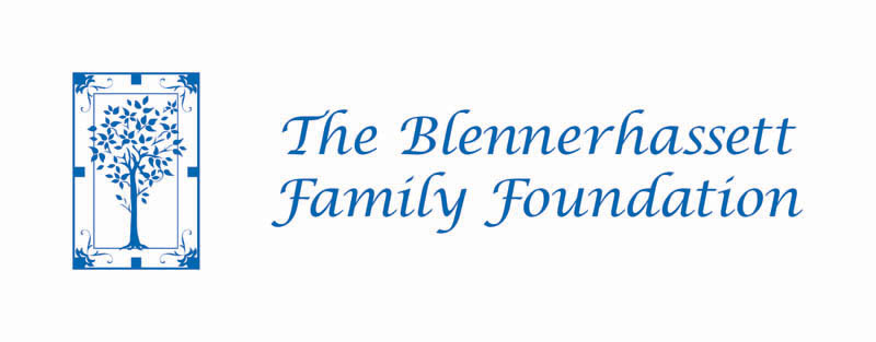
First glance at the logo pretty much says “home made logo circa late 80s/early 90s” and as I understand it, that’s exactly what it was. Something needed to change. Since these were friends who liked their logo (and didn’t really ask me to redesign it) I didn’t really want to change too much. The good news – with only a few slight tweaks, the logo could easily have new life.
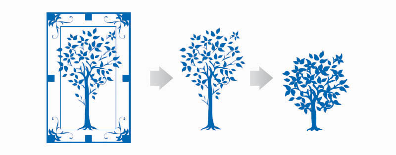
The first thing to go was the border. This border was pretty much all the rage when computer graphics came into being, but it was closing in on the tree image, making the logo appear a little too wooden and constipated. Getting rid of that border changes the look of the logo a lot. Already much improved!

I also shortened the truck of the tree to give everything a more compact look. Thickening the strokes on the tree a little helped make it look a little more contemporary and add a little more oomph when used small (like the website).
Then all was left was the type. The chancery font was basic early computerese and was the part of the logo that needed the most updating. This type of font is much loved by non-designers and usually much hated by proper designers. Rarely will you find us using these type of fonts.

Perfect!
As you can see, even small changes to an older logo can have a big impact. You don’t always have to throw everything away. Enjoy!
