
Brochures
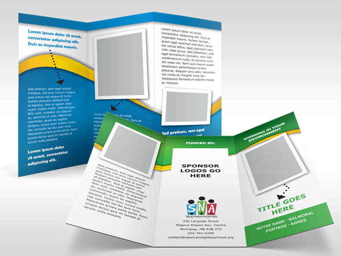
This is just a brief continuation of my previous post regarding my work at a United Way fundraising event, Goodwork. These area few of the sample templates I created for the Spence Neighbourhood Association. Since these are only templates, there is of course only the famous Lorem Ipsum dummy copy in place and no actual pictures in place. That will be up to the organization to supply for each brochure they actually make.
There were five different categories, each one getting their own colour treatment. Since future brochures would be done largely by non-dsigners, I wanted to keep a clean, uncomplicated layout with fonts I was fairly certain they already had, or would have easy access to. I chose a palette of nice, bright colours that went well with the existing logo and helped convey a sense of vitality and energy – important attributes for the client to convey to their audience. The arrows they were already using in some of their brochures. I liked them and kept them. It’s a quick, easy way to add some fun to the design and help to unite pictures and callouts with body copy. The pictures have large white borders, reminiscent of old-school polariod shots.
As I had mentioned earlier, was a fun, though stressful project. And I’m not too certain that I’ve heard quite the last from this project. We shall see.
The brochure mockups were created using some really elaborate looking Photoshop actions created over at PSDCovers.com. Check’em out!

One Response to “Brochures”
Reblogged this on Ash_Innovative69Bello and commented:
side note this really good ad design for my product
Comments are closed.