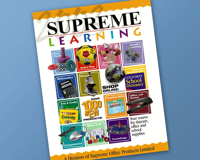
Supreme Learning Catalogue

Supreme Learning had a problem. They supplied teaching supplies to schools from Kindergarden all the way to grade twelve. They wanted to make certain that their entire product line was well represented on the cover so as not to alienate teachers from different school levels. Since the book itself was huge and broken up into different sections, an item from each section was placed on the cover and colour coded to match the section headers in the book. The while thing was outlined in a grid pattern and various callouts were added to even things out as there were an odd number of sections. The logotype was pre-existing.
