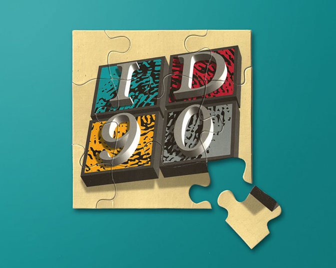
ID-90 Logo

This was a logo that was created for a local print broker. The only real direction we were given was to develop a “3D” looking logo. The hard part was the name of the company itself – it didn’t really mean anything. Juxtaposing the “ID” portion of their name and “identity” I came up with the idea of a fingerprint that was used both as a part of the logo and a design element for other elements of their visual identity. This was my favourite piece, a puzzle that was sent out as a teaser for the launch of their new logo.
